Creating a responsive WordPress website design is essential in today’s mobile-driven world. The number of people accessing the internet through mobile devices has skyrocketed, making mobile-friendliness an option and a necessity for any successful website. A responsive design ensures your site looks great and functions flawlessly on every desktop, tablet, or smartphone device. This adaptability is crucial for enhancing user experience, improving search engine rankings, and boosting conversions. By choosing WordPress for your web design, you leverage a platform known for its flexibility and wide range of responsive themes and plugins. In this blog, we’ll explore why responsive WordPress web design is the key to converting mobile visitors and how it can significantly impact your online presence and business growth.
What is Responsive Web Design & How it Works?
Responsive web design is a web development approach that creates dynamic changes to the appearance of a website, depending on the screen size and orientation of the device being used to view it. The main objective is to ensure users have an optimal viewing experience—easy reading and navigation with minimum resizing, panning, and scrolling—across various devices.
Read: How To Set Up And Launch Your WordPress Site
Here’s how it works:
- Fluid Grids: Unlike traditional design, which uses fixed-width layouts, responsive design uses fluid grids. The layout of the webpage is defined in relative units like percentages rather than absolute units like pixels. This allows the webpage to adjust its layout according to the screen size.
- Flexible Images: Images in responsive design are also fluid. They are sized in relative units to prevent them from displaying outside their element. This ensures that images resize within the confines of a flexible grid.
- Media Queries: These are a vital component of responsive design. Media queries allow the webpage to use different CSS style rules based on the characteristics of the device the site is being displayed on, most commonly the width of the browser.
- Responsive Typography: Text is designed to be easily readable on different devices. Text size and line height may change depending on the screen size to ensure legibility and improve the user experience.
Also Read: Website Redesign: Signs You Need A Website Makeover
The result is a seamless and consistent user experience across all devices. This approach to web design is increasingly important as the variety and complexity of devices on the market continue to grow. Responsive web design ensures visitors viewing your site from a smartphone, tablet, laptop, or desktop computer will have a user-friendly experience, crucial for keeping visitors engaged and interested.
Seahawk’s Expertise in Responsive WordPress Development
At Seahawk, we bring years of expertise in developing responsive WordPress websites. Our dedicated team of professional designers and developers works in close collaboration with clients to understand their unique brand identity and specific needs. We specialize in creating visually appealing mobile layouts and ensuring your website looks perfect on all devices, from the smallest smartphones to large desktop screens. Our commitment extends to delivering a website that looks great and performs exceptionally, ensuring it captivates your audience and drives conversions. With Seahawk, you can trust that your responsive WordPress website will be tailored to your brand, optimized for all devices, and aligned with the latest web standards.
Build A Website That Truly Reflects Your Brand
Say goodbye to cookie-cutter templates and hello to custom WordPress design with Seahawk.
Why is Responsive WordPress Web Design so Important to Convert Mobile Visitors?

Responsive WordPress web design is not just a trend; it’s an essential strategy to ensure a successful online presence, especially when converting mobile visitors. Here’s why it’s so crucial:
Google Prefers Responsive Design
Google’s mobile-first indexing prioritizes mobile versions of websites for ranking. A non-responsive site can suffer in SEO rankings, making it less visible in search results. Responsive WordPress web design ensures better performance in Google’s eyes, improving your site’s visibility and organic traffic.
Enhanced User Experience
Mobile users expect quick, easy navigation and readability. Responsive design automatically adjusts the layout, text size, and images to fit the screen size, providing a seamless experience. This enhances user satisfaction, reduces bounce rates, and increases the likelihood of conversions.
Related: How Much Does A Website Design Cost
Increased Mobile Traffic
With the growing number of people using mobile devices to access the internet, having a responsive website is essential to tap into this vast user base. You may miss out on significant traffic if your site needs to be mobile-friendly.
Future-Proofing Your Website
Technology evolves rapidly, with new devices and screen sizes emerging regularly. Responsive design means your website will adapt to future devices, saving you from constant redesigns. This adaptability makes it a timeless and cost-effective solution.
Consistency Across Devices
A responsive design ensures your website offers a consistent experience across various devices. This consistency helps build brand credibility and trust among users, regardless of how they access your site.
Better for SEO and Performance Metrics
Responsive WordPress web design improves load times, decreases bounce rates, and enhances other performance metrics crucial for SEO. Google’s Core Web Vitals, an upcoming major ranking update, is set to place even greater emphasis on user experience, making responsiveness more critical than ever.
Practical and Cost-Effective
Creating separate website versions for different devices is impractical and resource-intensive. Responsive design is a one-size-fits-all solution, reducing the time and cost of managing multiple site versions.
A Guide to Creating Responsive WordPress Design
Creating a responsive WordPress web design involves several necessary steps and considerations. Here’s a guide to help you through the process:
- Default Browser Zoom
Ensure that the default zoom on browsers displays your site correctly on all devices. This can be managed using viewport meta tags in your HTML.
- Fluid Element Widths and Heights
Use percentages rather than fixed pixel sizes for element widths and heights. This approach allows your content to adapt fluidly to different screen sizes.
- Image Optimization
Optimize images for faster loading times and adjust their sizes for different devices. Consider using tools or plugins for automatic image resizing.
- Design-Specific Breakpoints
Use CSS media queries to create breakpoints where your site’s layout changes to accommodate different screen sizes. This ensures a tailored experience for each device.
- Separate Responsive Menus for Mobile Devices
Implement different navigation menus for desktop and mobile. Mobile menus often use a hamburger icon to save screen space and improve usability.
Testing Across Devices
Regularly test your updated design on various devices and browsers to ensure consistent performance and appearance.
Considerations for Additional Elements
Incorporate responsive elements like tables, which require special attention to remain legible and functional on smaller screens.
Choosing the Right WordPress Theme

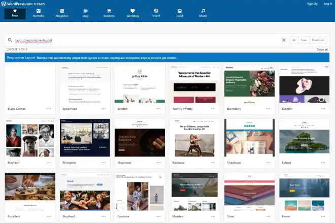
When selecting a theme, prioritize SEO and faster loading times. Consider using themes from reputable sources like WP Engine, which offers optimized, mobile-responsive themes.
Utilizing Mobile WordPress Plugins
Enhance your site’s mobile functionality with plugins. Options include:
- JetPack: Offers a range of features, including mobile theme creation.
- WPtouch: Customizes the mobile version of your site independently of the desktop version.
- WordPress Mobile Pack: Converts your site into a Progressive Web App (PWA).
Responsive Images
WordPress automatically handles responsive images since version 4.4. For older sites, add CSS to ensure images scale correctly on all devices.
Responsive Menus
Opt for a single flexible menu or separate menus for different screen sizes. Plugins like UberMenu, Max Mega Menu, and Responsive Menu can assist in creating user-friendly navigation for mobile users.
Responsive Tables
Ensure tables are readable on small screens. Plugins like TablePress, WP Table Builder, and wpDataTables can help create responsive tables.
Multilingual Capabilities
Use plugins like Weglot to add multilingual functionality to your site, enhancing accessibility for a global audience.
Related: Questions To Ask Before Hiring An Expert WordPress Developer
Mobile Responsiveness for SEO
Google rewards mobile-friendly sites in search rankings. Ensure your site is optimized for speed and user-friendliness on mobile devices. Choosing a high-quality hosting service that can contribute to better performance.
By following these guidelines, you can effectively convert your static WordPress web design into a responsive one, ensuring a better user experience across all devices and improving your site’s SEO performance.
Wrap Up
Building a responsive WordPress website is critical in ensuring your online presence is compelling and engaging in the modern digital world. As we’ve discussed, responsive WordPress web design caters to a wide range of devices, enhancing user experience and improving SEO performance. By choosing a professional service like Seahawk, you benefit from expert knowledge and a dedicated approach to creating a website that aligns with your brand identity and is optimized for performance across all devices. Remember, a responsive website is more than just a design choice; it’s a strategic investment in your online success, ensuring your site is accessible, user-friendly, and competitive in the ever-evolving digital landscape.
Ready To Stand Out In the Digital World?
Let’s bring your vision to life with personalized layouts, functionalities, and more!


