Bad UX can quietly destroy your website’s performance. From confusing navigation to poor accessibility, even small mistakes frustrate users and drive them away.
Think of autoplay videos, cluttered pages, or unclear interfaces. Users expect speed, clarity, and control across every screen. When those expectations fail, engagement drops fast.
The good news is you can fix it. With the right UX design approach, you can remove friction, improve usability, and turn a frustrating experience into one that keeps users coming back.
TL;DR: Fix What Breaks User Experience
- Poor navigation, cluttered layouts, and slow load times push users away quickly
- Real-world cases show how small design choices create big frustration
- Simple improvements like better spacing, fonts, and flow boost clarity
- User research and clear CTAs help improve engagement and conversions
Why Does UX Matter for Businesses?
A seamless, intuitive UX makes all the difference between customer loyalty and costly churn rates.

A good UX on WordPress sites provides a smooth, frictionless experience for users, making it easy to navigate, find what they need, and accomplish their goals efficiently.
This experience can be even more reliable when you avail of WordPress support services for 24/7 troubleshooting.
A user-centric site with tech support to reduce downtime will further eliminate frustration and confusion, leading to higher levels of customer satisfaction for the business.
Key Benefits of Prioritizing UX
- Boosts customer satisfaction and retention
- Enhances brand perception and credibility
- Increases conversion rates and revenue
- Improves overall productivity and efficiency
- Fosters a competitive edge
Tired of Bad UX Driving Users Away?
Our expert WordPress support ensures your site offers a seamless, user-friendly experience that keeps visitors engaged.
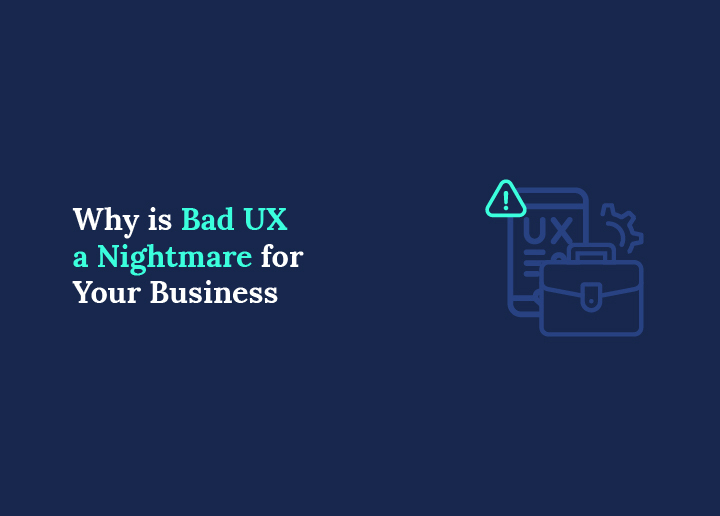
The Cost of Bad UX for Businesses
A bad UX design doesn’t just annoy users; it directly impacts your business. When websites or apps fail to meet users’ expectations, they leave, complain, and look for better alternatives.

Let’s break down the major ways poor UX can hurt your business.
Higher Bounce Rates
Imagine clicking a website only to encounter a cluttered interface, slow load times, or confusing navigation. Sounds frustrating, right?
Many bad UX design examples show that users won’t waste time figuring out a poor UI design; they’ll simply leave. Slow page transitions and disorienting user experiences make things worse, discouraging users from exploring further.
Lower Conversions
A website with poor usability will confuse users and make it hard for them to take action, whether it’s signing up, making a purchase, or subscribing to a service.
If your user interface is unclear or your forms require overly complex passwords, users may simply give up.
Damaged Brand Trust
When users experience poor UX, it leaves a lasting impression. Poor design decisions can damage your brand’s credibility and trust.
An example of this is Apple’s storage management system, which, despite the brand’s reputation for sleek design, once faced criticism for being unintuitive.
SEO Impact
Believe it or not, bad UX design also affects your website’s search engine rankings. Search engines like Google pay attention to user interactions such as time on site, bounce rate, and engagement. A slow page transition or poor mobile experience signals to search engines that your site provides a poor UX and is not user-friendly.
Real-World Examples of Bad UX
Bad UX design can lead to user frustration, decreased engagement, and even lost revenue.
Let’s explore real-world examples of bad UX that highlight common pitfalls in the UX design journey, focusing on elements such as unintuitive interfaces, unhelpful error messages, and dark UX patterns.
WhatsApp’s Delete Message Feature
While WhatsApp is known for its visually appealing interface and app-based convenience, its “Delete for Everyone” feature has sparked ongoing criticism.

Why It’s a UX Problem
Instead of deleting the message cleanly, WhatsApp replaces it with a notice saying, “You deleted this message.” This confuses recipients and can make situations awkward.
Users expect privacy, not a suspicious void. It doesn’t deliver a positive user experience, as it creates uncertainty and concern about what was deleted.
UX Tip: Clear user testing would reveal this gap in expectations. Messaging should align with the actual function. Consider alternatives like Gmail’s undo-send feature, which offers a grace period.
Netflix’s Hover Autoplay
Netflix excels in content delivery but falls short in UI intuitiveness with its hover-triggered autoplay feature.

Why It’s a UX Problem
Autoplaying trailers, even with the slightest hover, feels intrusive. Many users are constantly frustrated by this, especially when trying to browse quietly.
The autoplay function disrupts browsing, reducing user engagement and making the interface feel aggressive rather than helpful.
UX Tip: Avoid assumptions. Most users prefer control, especially when it comes to audio. Netflix could offer a toggle to mute or disable autoplay completely, enhancing the user-friendly experience and respecting users’ preferences.
Ryanair’s Booking Platform
Ryanair’s platform is notorious for hidden costs and confusing flows, classic dark UX tactics.

Why It’s a UX Problem
The airline buries the “No insurance” option inside a dropdown of countries, clearly hoping users won’t notice.
This deceptive strategy confuses potential customers and adds stress to a task that should be simple. It deliberately complicates simple tasks that many users expect to complete with ease.
UX Tip: Respect users’ time and intelligence. User testing can help identify where users feel manipulated. Transparent pricing and intuitive navigation foster loyalty over short-term revenue.
Apple’s Storage Management Pop-Up
Apple’s well-designed hardware is often paired with a frustrating storage UX.

Why It’s a UX Problem
Just as users are capturing important moments, photos, videos, etc. Apple’s storage warning halts everything. This bad user experience offers no real-time fix or storage solution. It prioritizes alerting over solving, leaving users scrambling.
UX Tip: Offer clear, in-the-moment solutions. Design storage management tools that allow users to free up space instantly. Prioritizing functionality over warning messages will vastly improve iOS’s user-friendliness.
Yahoo’s Outdated Design
Yahoo’s homepage feels like a relic of early web design, with information clutter and a lack of clear hierarchy.

Why It’s a UX Problem
An outdated design overwhelms users with too many links and little focus. It fails to enhance readability, which is crucial for product pages, news, and search results.
UX Tip: Focus on modernizing the layout. Break content into bullet points, use white space effectively, and restructure to highlight key actions or news. Even minor design updates can go a long way in improving user engagement.
Learn More: Are Dark Themes a Good Idea
5 Ways to Transform Bad UX into Quality UX
Elevating your digital experience from subpar to exceptional requires a strategic approach. As such, here are some key ways to transform bad UX into quality UX:
Conduct User Research
User research is the foundation of a great UX design. It involves gathering insights into your target audience’s needs, behaviors, and pain points.

By conducting user interviews, surveys, and usability testing, designers can identify the areas where the current UX falls short and tailor solutions accordingly.
This research helps ensure that the redesigned website meets user expectations and addresses real-world challenges. Ultimately leading to higher satisfaction and engagement.
Design Benefits
- Identifies user pain points and areas for improvement
- Ensures the redesigned experience meets user needs and expectations
- Provides insights into user behaviors and preferences
- Increases user satisfaction and engagement with the product
- Allows for data-driven design decisions based on real user feedback
Further Reading: Best Website Redesign Services
Use Negative Space Aesthetically
Negative space, or the empty areas surrounding design elements, is crucial in creating a visually appealing and organized interface.
When used effectively, negative space can highlight important information, improve content readability, and establish a sense of hierarchy and balance.
By strategically incorporating white space and minimizing clutter, web designers can transform a cluttered, overwhelming interface into a clean, breathable, and visually pleasing experience.
Design Benefits
- Enhances visual hierarchy and content prioritization
- Improves readability and comprehension of information
- Creates a sense of balance and organization
- Reduces visual clutter and cognitive overload
- Promotes a clean, modern, and aesthetically pleasing interface
Learn More: The Art of Minimalism in WordPress Design
Select Brand-aligned Color Palette
Color choices have a profound impact on user perception and experience. A well-crafted color palette can enhance brand recognition, evoke specific emotions, and guide users through the interface.

When transitioning from bad UX to high-quality UX, designers should carefully select a color scheme that aligns with the brand’s identity while considering accessibility, contrast, and visual hierarchy.
A cohesive, thoughtful color palette can greatly enhance the interface’s overall aesthetic appeal and usability.
Design Benefits
- Reinforces brand identity and recognition
- Evokes desired emotions and improves user experience
- Enhances accessibility and content readability
- Establishes visual hierarchy and guides user focus
- Contributes to an aesthetically pleasing and cohesive interface
Read More: How to Convert Your Design Prototype to WordPress
Select Fonts with Effortless Readability
Typography plays a vital role in ensuring seamless content consumption and enhancing the overall user experience.

When transforming bad UX, designers should prioritize selecting fonts that are legible and readable across various devices and screen sizes.
Factors such as font size, line height, and contrast should be carefully considered to ensure effortless readability, reduce eye strain, and improve comprehension.
Design Benefits
- Improves content readability and comprehension
- Reduces eye strain and fatigue for users
- Ensures consistency across different devices and screen sizes
- Enhances overall content consumption experience
- Contributes to a polished and professional aesthetic
Read More: How to Create Eye-catching eLearning Websites in WordPress
Ensure Reasonable User Flow and Goal-Oriented Visuals
A well-designed user flow is essential for guiding users through the interface to achieve their goals.

When transitioning from bad UX to quality UX, designers should carefully map out the user journey, identifying potential pain points and optimizing the flow accordingly.
Additionally, incorporating goal-oriented visuals, such as clear calls to action and intuitive navigation, can significantly enhance users’ ability to navigate and interact with the interface effectively.
Design Benefits
- Streamlines the user journey for efficient task completion
- Identifies and addresses potential pain points or friction
- Enhances navigation and discoverability of features
- Guides users towards desired actions and goals
- Improves overall user satisfaction and engagement
Also Read: Tips for Improving UX for Small Business Websites
Conclusion
Today, businesses must stay agile to thrive. Remember, transforming bad UX into a quality experience is an ongoing journey, not a one-time task.
Investing in training and professional development for UX teams, embracing emerging design trends and technologies, and maintaining a user-centric mindset throughout the organization are also crucial.
By prioritizing user experience as a continuous commitment, businesses can future-proof their websites, deliver exceptional experiences consistently, and pave the way for long-term success online.
FAQs About Bad UX
Why is line spacing important for UX Design in WordPress?
Line spacing improves readability and overall UX design. Proper spacing makes text easier to scan on any screen. It enhances accessibility and meets WCAG standards. Good spacing reduces bad design issues and improves navigation experience across the page.
How can I change line spacing in WordPress without coding?
You can use built-in blocks, menu settings, or a page builder tool. Many platform options let you adjust section spacing with simple controls. This approach works well for designers and beginners who want quick changes without touching code.
Can I adjust line spacing using CSS in WordPress?
Yes, you can use custom codes to control spacing. Add CSS to your theme or customizer. This method gives full control over text, headers, and sections. It is useful for advanced UX design examples and deeper optimization.
What is the ideal line spacing for better readability?
A line height between 1.5 and 1.8 works best for most desktop and mobile screens. It improves clarity and reduces visual complexity. Good spacing helps users scroll smoothly and understand information faster.
Does line spacing affect SEO and performance?
Line spacing does not directly impact Google rankings. However, it improves the user experience, which in turn affects engagement and traffic. Better readability increases time on page, lowers bounce rates, and supports overall performance and SEO goals.


