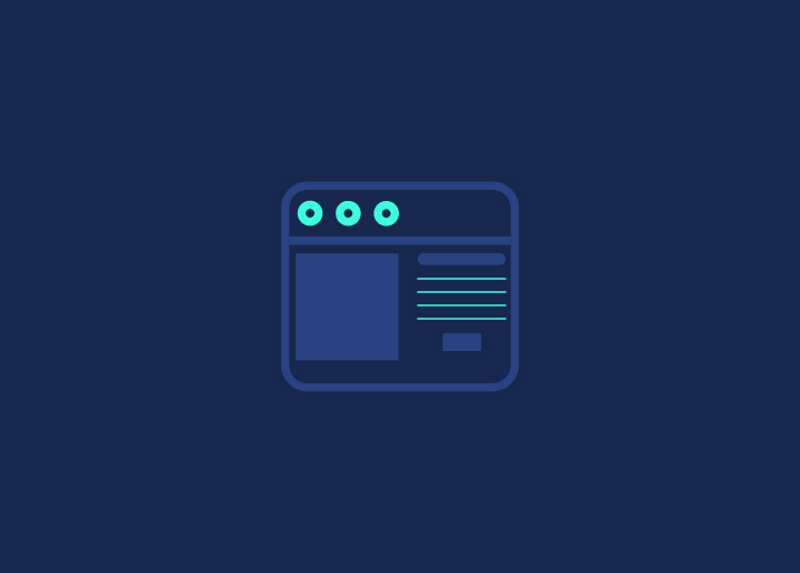
In web design, visual hierarchy is the arrangement of elements on a page according to their importance. This can be done using colors, sizes, and layouts. By creating a visual hierarchy, you can ensure that your users will see the most crucial information and can navigate your site easily.
Visual hierarchy is important to remember when designing any website or web application. It can help you create a more user-friendly interface and ensure your content is easy to consume.
Benefits of Visual Hierarchy In Web Design
Visual hierarchy is an essential principle in web design, as it helps to order and emphasize different parts of your content visually. By using colors, sizes, and layouts effectively, you can make sure that your message is clear and easy to understand.
An excellent visual hierarchy can help users scan a page and find the information they are looking for quickly and easily. It can also help to guide users through a complex website or app by clearly signposting the essential areas.
There are many benefits to using visual hierarchy in your web design, so it’s worth considering if you want to create a compelling and user-friendly site or application.
Strategies To Implement Visual Hierarchy
There are a few key strategies you can use to implement visual hierarchy in your web design:
1. Use colors to create contrast and draw attention to essential elements.
2. Use size and scale to highlight the most important parts of your content.
3. Utilize layout and grouping to create a clear and organized structure.
Tips For Effective Visual Hierarchy
- Create a visual hierarchy by using contrasting colors. Use light colors for less essential elements and dark colors for more important ones.
- Use different font sizes for different levels of importance. The most important text should be the largest, while the least important should be the smallest.
- Use different fonts or font weights for varying levels of importance. For example, you could use a sans serif font for headlines and a serif font for body copy.
- Align text differently to create a visual hierarchy. For example, you could left-align headlines and center-align body copy.
- Use spacing to create a visual hierarchy. More space around an element usually means it’s more important, while less space means less important.
- Use graphics or photos to create a visual hierarchy. You can use size, placement, and color to make some graphics more prominent.
Conclusion
Visual hierarchy is essential for web designers to remember when creating a website. Using colors, sizes, and layouts to order visually and emphasize different parts of the content’s message can help create a user-friendly experience that will ultimately result in more conversions and higher engagement. With so many design options available today, the visual hierarchy should be a fundamental principle when designing your website.
Further Reading: