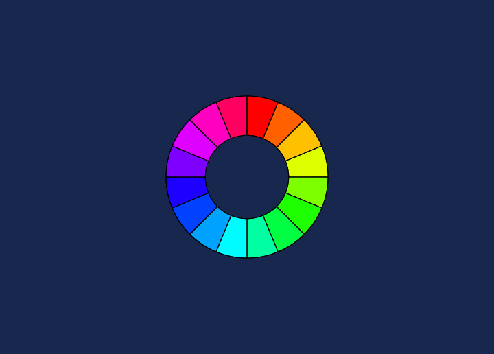
Designers use the color wheel to help create pleasing color combinations. A color wheel is a tool that shows relationships between colors. Colors opposite each other on the wheel are called complementary colors. Colors next to each other are called analogous colors.
The color wheel can be divided into warm and cool colors. Most websites use a combination of both warm and cool colors.
- Warm colors are red, orange, and yellow families.
- Cool colors are green, blue, and purple families.
When choosing colors for your website, consider what type of mood you want to create. For example, mainly using warm colors will create a passionate or energetic mood, while mostly cool colors will create a calm or serene mood. You can also use complementary colors to create contrast and visual interest.
Remember that not everyone sees color the same way, so choosing an easy eye palette is essential. Stick with a limited number of colors to avoid overwhelming your visitors. And when in doubt, black and white always make a classic combo!
Benefits of the Color Wheel in Web Design
A color wheel is a powerful tool that can help web designers create stunning, eye-catching websites. By understanding the basics of color theory, web designers can use the color wheel to choose complementary colors that work well together.
When used correctly, the color wheel can help create a visually appealing website that pleases viewers. Using the color wheel can also help ensure your website’s colors are consistent across all browsers and devices.
If you want to create a beautiful and user-friendly website, using the color wheel is a great place to start.
How to Select Colors Using the Color Wheel?
A color wheel is an excellent tool for choosing colors that work well together. Below are some tips for using the color wheel to select colors for your website.
Best Practices for Incorporating the Color Wheel into Web Design
1. Choose a color scheme. There are many color schemes, but some of the most popular are monochromatic, analogous, and complementary.
2. Consider the purpose of your website. First and foremost, it’s essential to consider the purpose of your website. What feeling do you want to evoke? Is it meant to be informative or purely aesthetic? Is it intended to be informative or purely aesthetic? Depending on the answer, you’ll want to use different color schemes because colors can significantly impact the overall tone of your site.
3. Look at the color wheel and find two or three colors you like. Make sure to choose colors that are next to each other on the wheel (analogous) or across from each other (complementary). For an informative website, it’s often best to stick with a neutral color palette. This will ensure that your content is easy to read and digest. If you want to add a pop of color, consider using one or two accent colors throughout your design.
4. Overall tone of the site: Another essential thing to keep in mind when incorporating the color wheel into your web design is the overall tone of your site. You want all of the elements on your page – from the text to the images – to work together cohesively. This can be achieved by sticking to a single color scheme throughout your design.
5. Experiment! Try out different combinations of colors to see what looks best on your site. You might be surprised at how well specific colors go together. Make sure your chosen colors complement each other well and don’t clash.
Examples of Websites That Utilize the Color Wheel
Color is one of the most important aspects of website design. It can set the site’s tone, influence user emotions, and affect conversion rates. A color wheel is a helpful tool for understanding how colors work together and can be used to create harmonious color schemes.
Some examples of websites that utilize the color wheel are:
- The home page of Google’s website uses a blue, yellow, and red color scheme.
- Apple’s website uses a variety of colors, but its products are mostly white or silver.
- Facebook’s site is blue and white.
- Twitter’s site is light blue and white.
Conclusion
Using a color wheel to help you decide on the colors for your website design can be invaluable. A color wheel is an easy-to-use tool that allows you to quickly and accurately choose colors that work well together. It also helps you create attractive, engaging visuals and stand out from the competition. With its help, you can create a visually stunning website with colors that perfectly reflect your brand’s message and identity.
Want to develop a visually-appealing & fully functional website? Get our professional website design services.


