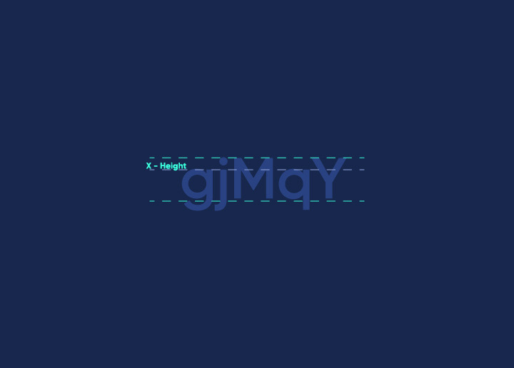
X-height is one of the most important aspects of a font design. It plays a significant role in the overall appearance and readability of the text. The x-height is the distance between the midline and baseline of a letter. It can also be referred to as the ascender, cap height, descender, or extender.
The x-height of a font can significantly impact its overall legibility. A font with a large x-height will be more easily readable than one with a small x-height. This is because the human eye is more sensitive to horizontal lines than vertical ones. Therefore, when all else is equal, a font with a larger x-height will be more readable than a font with a smaller x-height.
There are some tradeoffs when designing a font with a large x-height:
- It can make the text appear “blocky.”
- It can make the letters seem closer together, reducing readability for some people.
- It can make small letters (such as lower-case letters) appear too large in capital letters.
Ultimately, these tradeoffs must be balanced against the needs of the specific project for which the font will be used.
The Different Components of X-Height
In a letter, the x-height is the distance between the midline and baseline. The x-height is also known as the “body height” or “corpus size.” It is one of the most critical dimensions of a typeface, and it is used to determine the legibility of a typeface. The x-height can be measured in any unit of measurement, but it is typically measured in points or pixels.
The ascender is part of the letter that extends above the x-height. The ascender height is typically half of the x-height. The cap height is the distance between the baseline and the top of a capital letter. The descender is part of the letter that extends below the baseline. The descender depth is typically half of the x-height. The extender is an additional stroke that extends beyond the normal width of a character.
Tips for Designing With X-Height
In typography, x-height is the distance between a baseline and the mean line of lower-case letters in a typeface. It measures the size of letters about other letters in the same font.
Here are some tips for designing with x-height:
1. Use x-height to create hierarchy and contrast.
2. Keep x-heights consistent within a family of fonts.
3. Use x-height to create visual balance.
4. Consider x-height when choosing a typeface for body text.
Conclusion
The x-height of a letter is an essential consideration for type designers and typographers alike. With the right understanding of x-height, one can create a more harmonious and balanced design that captures attention without sacrificing legibility. Knowing how to harmonize these elements will ensure your designs effectively communicate their message clearly, regardless of the audience or context.