The most common screen sizes for web design in 2026 are 1920×1080 pixels for desktop, 1366×768 for laptops, 768×1024 for tablets, and 390×844 for iPhone 14. When designing for the web, you should set CSS breakpoints at 1200px for large desktops, 992px for desktops, 768px for tablets, and 576px for mobile.
This guide includes a full reference table of all major device screen sizes, the recommended CSS breakpoints for each, and guidance on testing your design across screen sizes.
TL;DR: Choosing the Best Website Dimensions for a Responsive, High-Performing Experience
- Screen size and pixel density shape design, readability, and user experience across phones, tablets, and laptops.
- Designing for common resolutions prevents horizontal scrolling and keeps layouts responsive on real devices.
- A mobile-first strategy improves usability, search visibility, and performance with flexible grids.
- Analytics insights help optimize dimensions, images, and layouts for smooth scaling on all screens.
Understanding Screen Size Metrics
Let’s dive into the nitty-gritty of screen size metrics. You’ve probably heard terms like pixels, resolution, and aspect ratios thrown around, but what do they really mean for your web design game?
First up, pixels. Think of these tiny squares as the building blocks of your screen. The more pixels you’ve got, the sharper your images and text will appear.
Also Read: Best Website Redesign Services
Now, resolution. It’s like the quality setting on your favorite streaming service, but for screens. Higher resolution means clearer, more detailed visuals.
And last but not least, aspect ratios. Imagine fitting a square peg into a round hole; that’s what aspect ratios are all about. They dictate the shape of your screen, whether it’s widescreen, square, or somewhere in between.
Revamp Your Site with WordPress Design Services
From optimizing screen sizes to crafting responsive layouts, we’ll ensure your website shines on every device.
Understanding Website Standard Size
Webpage size isn’t just an aesthetic feature; it’s a fundamental pillar of functionality and reach.
A website’s layout is akin to a building’s blueprint. It determines the flow of website traffic and frames the user’s journey from the homepage to the call to action.

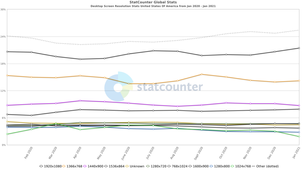
Over the years, we’ve witnessed desktop screen sizes expand from a modest 1024 pixels to a sprawling 1920 pixels, mirroring the growth of our monitors and our appetite for visual real estate.
However, the challenge isn’t merely adapting to the newest screen sizes but designing experiences that resonate across all devices.
Whether it’s ensuring that image dimensions don’t stretch into oblivion on mobile screen sizes or that file sizes don’t throttle load times to a crawl, the aim remains the same: to deliver the best image dimensions and webpage size regardless of where or how content is viewed.
And this is where standardization is important, and responsive design is the answer.
Learn More: Best White Label Website Design Agencies
Why Screen Size Matters in Web Design?
As more people browse the internet using different devices, from desktops to smartphones, responsive website design has become essential. Users switch between devices with varying screen resolutions, and your site needs to adapt to them all.
The Rise of Multi-Device Usage
With device usage trends shifting toward mobile users, designing for smaller screens is no longer optional.
People access websites on various devices, whether in portrait mode on a phone or landscape mode on a tablet, and they expect clear, functional layouts.
Ignoring mobile screen resolutions can lead to lost traffic and conversions. Incorporating web app testing into your design process helps verify that layouts, navigation, and performance remain consistent across devices.
Layout, Readability, and User Experience
Different screen widths affect how your website’s content is displayed. For example, a layout designed for desktop might look cluttered or unreadable on a phone.
That’s where responsive design principles come in: CSS media queries, fluid designs, and flexible layouts that adapt to different screen sizes. Good design also considers font size, max width, and the need to avoid horizontal scrolling.
Mobile-First vs Desktop-First Design
Starting with a mobile-first approach ensures your content loads quickly and clearly on smaller-screen devices, aligning with modern user behavior and digital marketing trends. You can then scale up for desktop layouts.
Alternatively, a desktop-first approach focuses on larger displays first, then adapts down. Either way, testing across multiple screen sizes and using tools like Google Analytics helps you understand your target audience and deliver an optimal user experience.
Common Screen Sizes for Web Design
When it comes to WordPress web design, one size definitely doesn’t fit all. Let’s break it down by device:

Desktop and Laptop Screen Sizes
- Standard Resolutions: From the classic 1280×720 through 1920×1080, desktops and laptops come in all shapes and sizes.
- Popular Aspect Ratios: Think 16:9 for that widescreen cinematic feel, or 4:3 for a more traditional vibe.
Read More: Tips for Improving UX for Small Business Websites
Tablet Screen Sizes
- Key Metrics and Trends: Tablets may not be as ubiquitous as phones, but they still pack a punch with resolutions ranging from 601×962 to 1280×800.
- Responsive Design Strategies: Flexibility is key here. Responsive design ensures your site looks just as stunning on a tablet as it does on a desktop.
Mobile Screen Sizes
- Dominant Resolutions: With the rise of smartphones, resolutions ranging from 360×640 to 414×896 have become the norm.
- Designing for Small Screens: It’s all about optimizing for space. Streamlined layouts, larger fonts, and intuitive navigation are your best friends.
Learn About: Responsive Design Beyond Mobile
Best Screen Sizes
By tailoring your design to these common screen sizes and choosing suitable website templates, you’ll ensure your website looks pixel-perfect no matter how your audience accesses it.
- Desktop/Laptop: Aim for a sweet spot around 1366×768 or higher for broad compatibility.
- Tablet: Opt for a responsive design that adapts seamlessly to resolutions like 1024×768.
- Mobile: Design with resolutions like 375×667 or 360×640 in mind for a user-friendly experience.
Standard Dimensions for Different Devices
Given the expanding digital ecosystem, teeming with diverse devices with unique screen sizes and resolutions, adapting your website to fit various screens becomes imperative.
| Category | Description | Standard Webpage Dimensions | Key Design Considerations |
| Desktop Devices | Desktops offer a large screen canvas, typically around 1440 pixels wide, suitable for high-definition content and immersive experiences. They cater to common screen resolutions and are primarily used in professional settings. | 1440 pixels (width) | Ensure the large-screen canvas is used effectively to create a straightforward, user-friendly interface. Design for various screen resolutions, from 1080p to 4K, to maintain a consistent user experience. Implement responsive design techniques to uphold the brand’s integrity across desktop screens and browsers. Ensure websites appear crisp and complete, providing a seamless experience across different desktop setups. |
| Mobile Phones | Mobile phones are multi-functional devices, and the standard webpage size is 360×800 pixels. This size balances detail and functionality, making it a benchmark for mobile websites. | 360×800 pixels | Mobile phones are multi-functional devices, and the standard webpage size is 360×800 pixels. This size strikes a balance between detail and functionality, making it a benchmark for mobile websites. |
| Tablets and iPads | Tablets and iPads bridge the gap between mobile phones and desktop computers. Their standard webpage size is 768×1024 pixels, which enhances readability & interaction and offers a spacious canvas for various activities. | 768×1024 pixels | Create a responsive layout that transitions smoothly between portrait and landscape orientations. Ensure the webpage automatically scales to fit the screen space without requiring cumbersome adjustments. Enhance readability and interaction by tailoring the design specifically for tablet dimensions. Design dynamic interfaces that adjust to user needs, providing a seamless experience across different orientations and usage contexts. |
Why Does Webpage Size Matter?
Venture beneath the surface of a webpage, and you’ll find a complex anatomy of HTML, CSS, and images; each contributing to the total file size that determines how swiftly a page springs to life on your screen.
As the digital age accelerates, webpage sizes have swelled, nearly doubling from 1.2 MB in 2014 to 2.2 MB for desktop sites as of 2022. This growth is not without consequence; it’s a balancing act where every kilobyte counts.
This is where the true significance of webpage size emerges; it’s a pivotal factor in both user experience and SEO. A bloated webpage can trudge along at a snail’s pace, frustrating users and sending them scurrying away after just a few seconds of delay.
With their keen algorithms, search engines are also equally impatient, favoring fast websites that load with alacrity, thereby influencing your site’s ranking in the digital hierarchy.
Thus, optimizing webpage size isn’t merely a technicality but a strategic move that can bolster your digital footprint.
Also Learn: Why Should You Use CSS Grid and Flexbox in Web Design
Factors to Consider When Choosing Your Website Size
Here’s a brief table summarizing the factors to consider when choosing your website size:
| Factor | Description |
| Type of Content | Text-heavy content requires larger screens to avoid excessive scrolling. Video-centric sites benefit from smaller dimensions to focus on media playback without additional load. Custom fonts and interactive elements demand more space and resources to maintain performance. |
| Frequency of Content Updates | Frequently updated websites require a fluid design that seamlessly integrates new content. A modular design helps incorporate updates without increasing load times. The layout must accommodate regular content growth while preserving design integrity and ease of navigation. |
| Number of Pages | Websites with many pages need an intuitive and comprehensive navigation system. High page counts require structures that guide users efficiently through extensive content. Simpler sites with fewer pages should focus on a streamlined experience to resonate with a focused audience. |
Further Reading: Vital Elements of a Custom WordPress Design
Benefits of Responsive Web Design
Imagine a fluid web where pages ebb and flow to fit the screens they’re viewed on, from the tiniest smartwatch to the widest monitor.
This is the essence of Responsive Web Design (RWD), a harmonious approach that tailors the web experience to each device, ensuring that no user is left behind.
Adopting this flexible approach can improve user experiences, improve search engine rankings, and decrease maintenance expenses.
Below are the advantages that highlight how responsive design has moved beyond mere trends to become a pillar of contemporary web development.
Enhanced User Experience
User experience is crucial for any website, and responsive design ensures compatibility across all devices.
A responsive website adapts to the screen it’s viewed on, whether it’s a desktop, laptop, tablet, or mobile phone, providing a consistent experience.
This flexibility allows users to transition seamlessly between devices, maintaining familiarity and functionality.
Additionally, fluid layouts optimize high-resolution images and layouts across devices, preventing distortion and preserving quality. This commitment ensures that every user enjoys a navigable and appealing site, regardless of their device.
Read More: Top B2B Web Design Agencies
Better Search Engine Rankings
Search engines favor mobile-friendly sites that load quickly, with Google prioritizing the mobile search experience. Sites that ignore this may notice a drop in search rankings.
This makes responsive design important as it simplifies SEO by consolidating strategies across all devices, reducing redundancy, and enhancing search engine rankings.
Thus, by investing in a responsive site, you can see increased site visibility and traffic, ultimately resulting in more leads.
Know About: Difference Between a Mobile Site And a Responsive Site
Reduced Maintenance Costs
Beyond the user experience and SEO benefits, responsive web design is also a boon for the bottom line. Managing a single responsive site is more cost-effective than juggling multiple versions tailored for different devices.
Updates and modifications can only be made once, eliminating the duplication of effort and resources that come with maintaining separate mobile versions and desktop layouts.
WordPress developers and web designers can also focus on enhancing a single, cohesive site rather than splitting their attention across multiple platforms.
This streamlined approach not only simplifies maintenance but also ensures that enhancements or fixes are universally applied, keeping the responsive website in prime condition across all touchpoints.
Image Size Guidelines for Websites
When we speak of a webpage’s visual allure, images take center stage, yet their beauty must be conscientiously curated.
The art of selecting the perfect image size for websites is a balancing act between image quality and website performance, aiming to captivate without causing undue delay.
Whether dealing with a captivating background image or an attractive product photo, it’s crucial to understand the guidelines for image dimensions, file sizes, and other specifications.
Also, choosing the appropriate image format is important for creating a fast, visually impressive website.
| Image Type | Recommended Dimensions | Aspect Ratio | File Size Optimization |
| Background Images | 1920×1080 pixels | 16:9 | Optimize for clarity. 72 Pixel Per Inch (PPI) |
| Hero Images | 1280×720 pixels | 16:9 | Keep below 1800 pixels |
| Banner Images | Various sizes 300×200 pixels 970×90 pixels 160×600 pixels | Optimize to around 150 KB |
Tools for Testing Responsive Design
Let’s check out some of the most effective tools for evaluating and refining a website’s responsive design.
Testsigma and BrowserStack offer extensive cross-browser and device testing capabilities that span thousands of browser-OS combinations and device environments.

This free Mobile-Friendly Test provides a quick, easy way to assess a website’s mobile compatibility. It offers insights into how well a site translates to a small screen with just a URL or snippet of code.
These tools are the compasses that guide web developers through the intricate journey of responsive design, ensuring that every path leads to a website that is as adaptable as it is accessible.
Best Practices for Responsive Web Design
Let’s delve into the world of responsive web design and uncover some tried-and-true best practices to make your site shine on screens big and small:
Responsive Frameworks
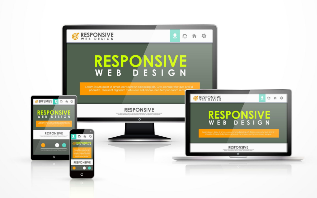
Responsive frameworks like Bootstrap and Foundation provide a solid foundation for building websites that look great on any device.
- Grid Systems: Grid-based layouts offer a flexible structure that adapts seamlessly to different screen sizes. Think of it like a digital puzzle; the pieces rearrange themselves to fit whatever space they’re given.
- Component Libraries: Pre-built components and UI kits streamline the design process, allowing you to focus on crafting engaging content rather than reinventing the wheel.
Media Queries and Breakpoints
Media queries are your secret weapon in the battle for responsiveness. By defining specific conditions based on screen size, orientation, and other factors, you can tailor your site’s layout and style to suit each device.
Breakpoints mark the points at which your layout shifts to accommodate different screen sizes. Strategic breakpoint selection ensures a smooth transition between layouts, avoiding awkward jumps or squished content.
Fluid Layouts vs Fixed Layouts
Fluid layouts use relative units like percentages and ems to scale elements proportionally, ensuring a consistent experience across devices. It’s like pouring water into different-sized containers; the content fills the space without losing its shape.
Fixed layouts, on the other hand, specify exact pixel values for elements, resulting in a more rigid design that may not adapt as gracefully to varying sizes for the screen. While fixed layouts have their place, fluid layouts offer greater versatility in today’s multi-device landscape.
Summary: Choosing the Right Screen Size for Your Website
In summary, selecting the right screen size for your website is crucial for delivering an exceptional user experience across all devices.
By considering factors such as device compatibility, user experience, and design adaptability, you can ensure your site looks polished and performs optimally across desktop, laptop, tablet, and smartphone devices.
Responsive web design principles, including frameworks, media queries, and fluid layouts, provide the tools to create flexible, adaptable layouts that seamlessly adjust to different screen sizes.
Remember, the ultimate goal is to prioritize user satisfaction and accessibility. By choosing the right screen size and implementing responsive design, you can enhance your website’s usability and leave a lasting impression on your visitors.
So, whether they’re browsing on a desktop at home or a smartphone on the go, your website will always look its best.
FAQs on Website Screen Sizes
What are the standard webpage dimensions for desktop, mobile, and tablets?
The standard webpage dimensions for desktops, mobile devices, and tablets are approximately 1440 pixels for desktops, 360×800 pixels for mobile devices, and 768×1024 pixels for tablets and iPads. This caters to common device screen resolutions and is essential for responsive design.
Why does website page size matter?
Website page size matters because it can significantly impact user experience and SEO rankings. Larger page sizes can lead to slower load times, discouraging users and negatively affecting SEO rankings.
As such, optimizing page size is essential to improve load times, making a site more accessible and increasing its chances of ranking higher in search results.
How does responsive web design benefit SEO?
Responsive web design benefits SEO by providing a better mobile search experience and consolidating SEO efforts across devices. This can ultimately lead to improved search engine rankings and visibility.
What are some recommended image size guidelines for websites?
When choosing website images, opt for a background size of 1920×1080 pixels, hero images at 1280×720 pixels, and banners at 300×200 pixels or 970×90 pixels. Also, keep the file size around 150 KB to ensure faster loading, optimal display, and performance.
What screen size should I design for the web?
Design for a range of screen resolutions to support various screen sizes and device types. Start with mobile resolution (e.g., 375px), then scale up to tablet and desktop resolutions (e.g., 1440px or 1920px).
The following responsive design sizes ensure your web pages look great across different screens and provide a seamless user experience.
What is the best image size for web design?
Use images that balance quality and performance. A standard resolution like 1200×800px works well for most web pages, but always resize based on your screen width and layout.
Compressed images improve load time across desktop layouts, mobile devices, and tablet screen resolutions, helping your online business retain more website visitors.
What is the best size monitor for web development?
A monitor with a 1920×1080 or 2560×1440 resolution is ideal for web development. These are among the most common screen sizes and give you enough screen real estate to view multiple browser windows, test layouts, and check responsive design testing easily.
Why design on 1440?
Designing on a specific resolution like 1440px is a sweet spot; it reflects one of the most popular desktop screen resolutions and fits well within many operating systems and browser window sizes.
It allows you to craft a balanced desktop layout while leaving room for scaling down with adaptive design for mobile devices and other screens.

