WordPress sites leverage responsive design by using themes that adapt seamlessly. This ensures a consistent and user-friendly experience across desktops, tablets, and smartphones, eliminating the need for separate mobile versions while providing optimal viewing for all visitors. Responsive design beyond mobile offers a consistent user experience across various screen sizes. That includes desktops, laptops, tablets, and smartphones.
Further, responsive WordPress web design enhances usability and accessibility, ensuring that all users can access and interact with the website effectively, regardless of their device or platform. Additionally, responsive design can improve search engine optimization (SEO) by delivering a better user experience, a ranking factor for search engines.
Why Do You Need a Website Responsive to All Devices?
Adopting a mobile-first design principle for WordPress web designs is crucial because increasing number of users are accessing websites through their mobile devices. By prioritizing mobile user experience, you can ensure your website looks great and functions seamlessly on smaller screens, often with limited real estate and interaction patterns.
If you are looking for reasons as to why you should have a website with responsive design beyond mobile, here is why:
- Users expect a seamless mobile website experience.
- Google favors mobile-friendly sites for better rankings.
- Simplifies the design process, focusing on core elements.
- Enhances performance on mobile devices with limited resources.
- Progressively enhances the experience for larger screens after mobile.
Adopt a mobile-first approach on the next website redesign project for your business. It should involve designing and developing the website with mobile devices in mind first and then progressively enhancing the experience for larger screens.
This method helps simplify the design process, focusing on essential content and functionality and avoiding bloat that could hinder performance on mobile devices. Furthermore, search engines like Google prioritize mobile-friendly websites, making a mobile-first design principle essential for better search engine optimization (SEO), better showcasing of content according to content relevance and user engagement.
Read More: Top Web Design Tools for Designers in 2024
Tips to Make Your Device Optimally Responsive
Optimizing your website for responsive design across devices requires careful planning and implementation. Here are some essential tips to ensure your site is optimally responsive:
1. Find a Responsive Web Theme
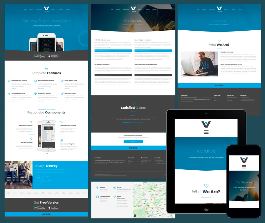
Choosing a responsive theme is essential for ensuring your WordPress site is optimized for all devices beyond just mobile. While mobile responsiveness is crucial, a well-designed responsive theme ensures a seamless experience across various screen sizes, including desktops and tablets.
By selecting a responsive theme, you can:
- Provide a consistent UI design experience for customer-facing sites (like shopping portals), maintaining your site’s layout and functionality across devices.
- Future-proof your site by automatically adapting to new device sizes and resolutions.
- Focus on content and design elements, knowing the theme handles the technical aspects of responsiveness.
For self-hosted WordPress sites, carefully evaluating themes for their responsiveness is crucial. However, with WordPress.com hosted sites, all themes are built to be mobile-responsive and cross-browser compatible, allowing you to concentrate on content and design without worrying about the underlying responsiveness.
Learn More: Best WordPress Hosting Providers in 2024
Craft Seamless Experiences Across All Devices!
Make sure your website shines on every screen! From desktop to mobile and everything in between, we craft seamless experiences for all devices.
2. Keep Navigation To-the-point
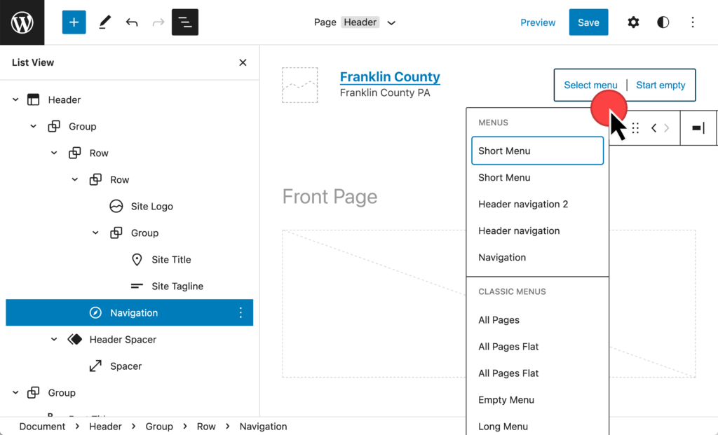
Maintaining a concise navigation menu ensures an optimal responsive experience across devices. A lengthy menu that may be readable on larger screens can become challenging to navigate on smaller devices.
By simplifying your menus, you can:
- Improve usability by making navigation easily scannable for users on various screen resolutions.
- Provide a consistent and user-friendly experience, regardless of the device or screen size.
- Focus on essential navigation elements, enhancing the site’s overall responsiveness.
Keeping your navigation concise is crucial to creating a responsive website that delivers a seamless experience for all users, from desktop computers to mobile devices.
3. Ensure that Your Site is Searchable

Incorporating a robust search functionality is crucial for ensuring an optimal responsive experience across devices. As highlighted by a Google study, a functional site search is one of the most essential elements of a mobile-friendly site.
To enhance searchability, you can:
- Implement a prominent search bar that is easily accessible on all screen sizes.
- Leverage blocks and plugins to enable visitors to quickly locate desired information.
- Improve the overall user experience by facilitating efficient content discovery.
By making your site searchable, you can provide a seamless and user-friendly experience for visitors accessing your site from various devices, ensuring they can easily find the information they need.
4. Customize Efficiently
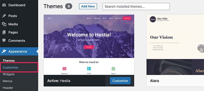
If your website features a number of custom elements, such as unique images or custom font families, ensuring their optimal display across different screen sizes is crucial. To achieve this, you can:
- Utilize CSS media queries to apply different sets of rules to custom elements. Also remove unused CSS when necessary to maintain web hygiene.
- Base the rules on conditions like browser width or device type.
- Ensure all your customizations appear at the proper resolution on various screen sizes.
By leveraging CSS media queries, you can optimize the display of custom elements, providing a consistent and visually appealing experience for users accessing your site from different devices and screen resolutions.
Also Read: How To Avoid CSS @Import To Improve Page Load Speed
5. Upload Mobile-friendly Forms

Ensuring your site’s mobile-friendly forms are responsive to devices is crucial for providing an optimal experience.
To achieve this, you should:
- Carefully review custom contact forms to ensure seamless functionality on smaller screens. Use best WordPress contact form plugins for this.
- Avoid allowing pop-up forms to take up the entire screen, as this can hinder usability on mobile devices.
- Implement form designs that are intuitive and easy to interact with, regardless of the device or screen size.
By paying attention to the mobile-friendliness of forms, you can enhance the overall user experience and ensure that users can efficiently complete form submissions, regardless of the device they use to access your site.
6. Optimize Images

Proper image optimization is crucial for ensuring an optimal responsive experience across devices.
To achieve this, you should:
- Ensure images are sized appropriately, adhering to recommended maximum dimensions to prevent slowing page load times. Use the best image optimization plugins for this purpose.
- To improve performance, reduce image file sizes through compression in photo editing software before uploading.
- Choose the appropriate file format, such as JPEG, for most images, to balance quality and file size.
- Avoid large PNG files, as they tend to have larger file sizes, impacting load times negatively.
By optimizing images for responsive performance, you can enhance the overall user experience, ensuring faster page load times and seamless functionality, regardless of the device or screen size used to access your site.
7. Prioritize Readability and Content Layout
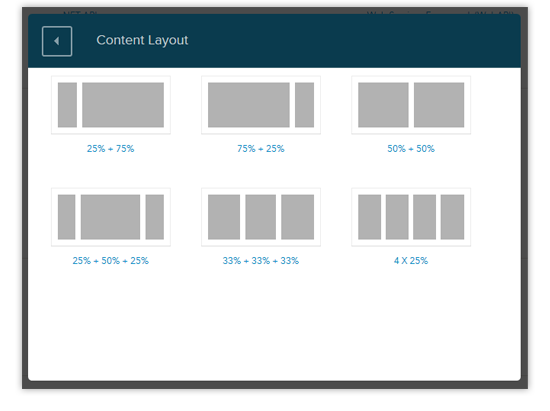
Ensuring optimal readability and well-organized content layout is essential for delivering a user-friendly responsive experience across devices. Often, a dynamic content layout adds engagement value in WordPress sites.
To achieve this, you should:
- Integrate white space into your website’s layout, improving visual clarity and reducing clutter.
- Utilize easily readable fonts and organize content into concise paragraphs, especially for mobile users.
- Limit the amount of content displayed on smaller screens, making the site more navigable for mobile users.
- Prioritize clear and structured content presentation, enhancing the overall reading experience.
By focusing on readability and content layout, you can provide a seamless and engaging user experience, regardless of the device or screen size used to access your site.
8. Proactively Test for Optimal Responsiveness
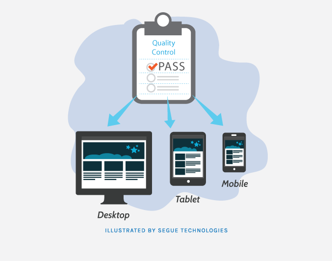
Proactive testing ensures your site delivers a seamless browsing experience across devices.
To achieve optimal responsiveness, you should:
- Thoroughly double-check your site to identify and address any responsiveness issues.
- Preview your site on various browsers and devices to ensure consistent and visually appealing display.
- Guarantee that your site showcases your business in the best possible way, regardless of the device used.
- Prioritize responsive design to provide an intuitive, user-friendly experience, encouraging customer engagement and conversions.
- Remember that your website only gets one chance to make a positive first impression on potential customers.
By proactively testing and optimizing for responsiveness, you can ensure that your site meets the expectations of modern users, who demand a consistent and seamless experience across their different devices.
Conclusion
The widespread usage of devices with different screen sizes has made responsive design a crucial aspect of contemporary web development. WordPress sites can deliver a consistent and user-friendly experience across desktops, tablets, and smartphones by adopting responsive design principles. From optimizing visuals and layouts to ensuring smooth navigation and search capabilities, careful attention to detail is paramount.
By following best practices and actively testing for responsiveness, WordPress site owners can create websites that leave a lasting positive impression, encourage user engagement, and improve search engine visibility. Ultimately, an effective, responsive design strategy is vital for staying ahead in the ever-changing digital realm.

