CSS Grid and Flexbox are indispensable tools for crafting dynamic web layouts. With CSS Grid, WordPress development can gain a significant edge with intricate grids, offering precise control over rows and columns. This facilitates the creation of complex, multi-dimensional custom website designs.
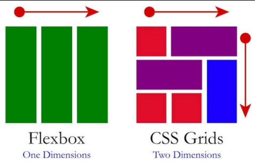
On the other hand, Flexbox excels in organizing elements within a single dimension, streamlining alignment and distribution. Together, they empower designers to fashion responsive and visually captivating interfaces with web design tools effortlessly. WordPress developers can ensure seamless adaptation to various screen sizes and devices by harnessing the versatility of CSS Grid and Flexbox, enhancing user experience across the digital landscape.
A Brief on CSS Grid and Flexbox
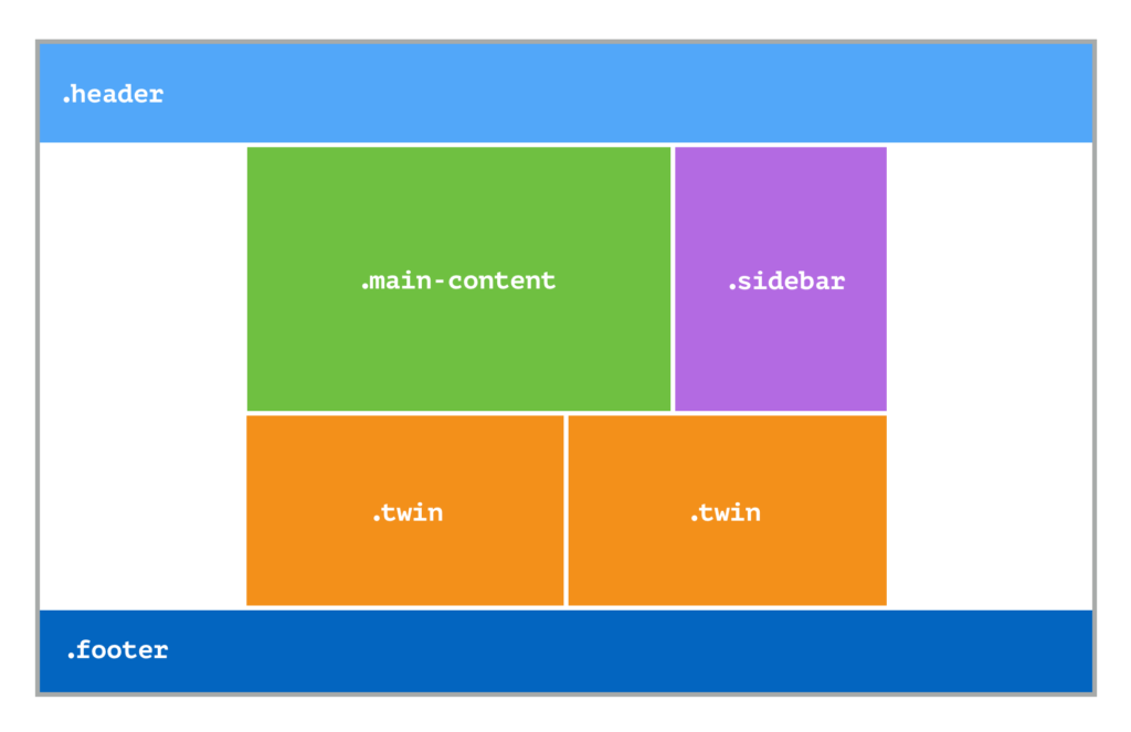
CSS Grid stands out as a remarkable aspect of the CSS language, offering various tools for crafting sophisticated and flexible layouts. Although its complexity may initially seem daunting, CSS Grid has become a cornerstone for modern layout design since its widespread adoption by major browsers in 2017, boasting a remarkable 97.8% user support, according to Caniuse.
Also Read: How To Add Custom CSS In Elementor?
Unlike its predecessors like Flexbox, CSS Grid allows for multidimensional layouts with defined rows and columns directly in CSS, enabling developers to build adaptable and intricate designs effortlessly.
CSS Grid divides a single DOM node into rows and columns, a feature showcased in this tutorial by highlighting them with dashed lines, although they’re invisible in practice. This approach is unconventional; additional DOM nodes are typically required to create compartments in other layout modes. For instance, in Table layout, each row is formed using <tr>, and each cell within the row is designated by <td> or <th>.

The Flexbox Layout module, a W3C Candidate Recommendation since October 2017, aims to streamline the arrangement, alignment, and distribution of space among items within a container, even when their dimensions are unknown or dynamic—hence the term “flex.”
Its core concept empowers the container to adjust items’ width/height and optimally utilize available space, catering to diverse display devices and screen sizes. Unlike traditional rectangular color blocks or inline layouts, Flexbox is direction-agnostic, offering superior flexibility for accommodating orientation changes, resizing, and complex applications.
Note: Flexbox suits application components and small-scale layouts, while the Grid layout is ideal for larger-scale designs.
Also Read: How To Reduce Cumulative Layout Shift In WordPress
In a flexbox layout, items are arranged along the central or cross axes.
Central Axis: The primary direction in which items are placed. It might only sometimes be horizontal; it depends on the flex-direction property.
Main-start | Main-end: Items are positioned within the container, starting from main-start and ending at main-end.
Primary Size: The width or height of an item along the central axis.
Cross Axis: The direction perpendicular to the central axis.
Cross-start | Cross-end: Items are placed from the cross-start side to the cross-end side to maintain visual hierarchy.
Cross Size: The width or height of an item along the cross-axis.
Benefits of CSS Grid and Flexbox
CSS Grid and Flexbox changed the course of web layouts, providing robust and flexible tools to create complex designs. These modern layout techniques offer numerous advantages over traditional methods:
Responsiveness
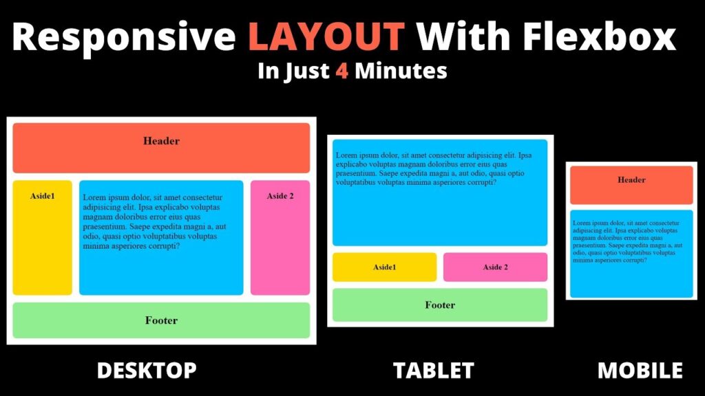
CSS Grid and Flexbox help web designers make layouts that change to fit various screen sizes and devices. They let designers create dynamic layouts that can adjust to different screen sizes easily without needing complicated media queries or JavaScript.
Also Read: Responsive Design Beyond Mobile: Crafting Experiences for All Devices
Flexible Layouts
CSS Grid and Flexbox help web designers make more flexible layouts. These tools make it easy for designers to create complicated layouts with less code to develop websites faster and more efficiently.

Simplified Code
CSS Grid and Flexbox make it easier to create complicated layouts with less code. This means developers can spend less time writing code and more time working on design and features.
Learn More: How To Reduce The Impact Of Third-party Code?
Reusable Code
CSS Grid and Flexbox empower developers to craft reusable code snippets for frequently used layout elements. This capability allows developers to replicate similar layouts across multiple pages efficiently, minimizing the time and effort invested in development tasks.
By leveraging these tools, developers can streamline their workflow and focus more on enhancing their websites or applications’ overall user experience and functionality.
Improved Accessibility
By utilizing CSS Grid and Flexbox, designers can create more flexible layouts that adapt seamlessly to various screen sizes and device orientations. It improves the overall user experience for individuals with diverse needs. This inclusivity ensures that everyone can access and engage with digital content effectively regardless of their abilities.
Read More: WordPress Accessibility Guide: Compliance with WCAG Standards
Improved SEO
CSS Grid and Flexbox play a pivotal role in enhancing search engine optimization (SEO) by facilitating the creation of more semantic HTML structures. This results in websites better understood by search engines, ultimately leading to improved rankings in search results.
By utilizing CSS Grid and Flexbox, designers can structure their code to accurately represent the content hierarchy and relationships within a webpage, making it easier for search engine crawlers to interpret and index the content effectively.
Also Read: Complete SEO Checklist
Conclusion
In summary, CSS Grid and Flexbox serve as powerful layout tools that empower web designers to craft layouts that are not only flexible and responsive but also contribute to better SEO practices. Through the utilization of these tools, developers can streamline their coding processes, enhance accessibility, and ultimately create websites that deliver an optimal user experience while also achieving higher visibility in search engine rankings.
