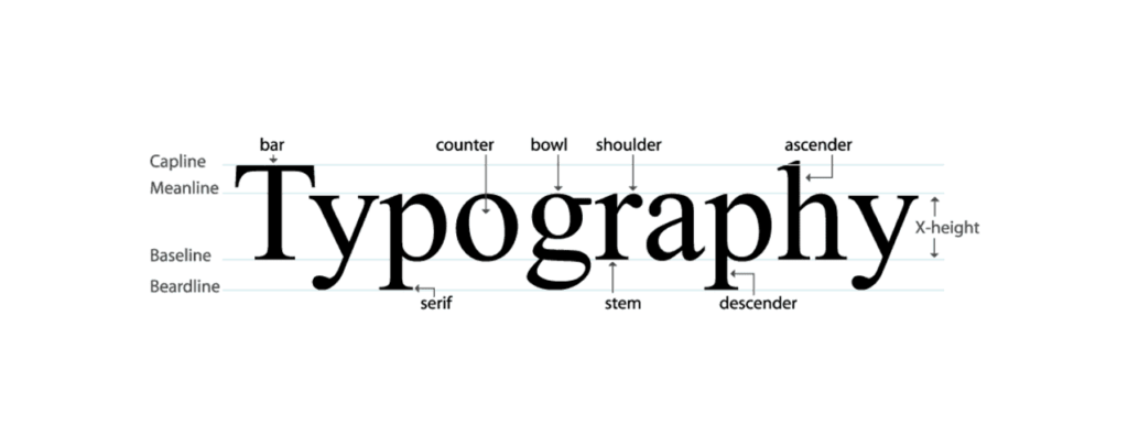
When we consider what makes a website stand out, we often consider its layout, colors, and images. But there’s another hero working quietly behind the scenes: typography. It’s everywhere, from the billboards we pass to work to the websites we scroll through daily. Typography is the art of arranging text to make it readable and visually appealing, and it plays a crucial role in how we perceive and interact with content online.
Establishing a unique and memorable brand identity is critical in the competitive landscape of the internet, where countless websites are just a click away. This is where typography comes into play.
It’s not just about choosing a font; it’s about creating a connection between the text and its presentation, making sure your message isn’t just seen but truly resonates with the audience.
Good typography doesn’t just make your website look attractive; it enhances the user experience, guiding visitors smoothly through your content and ensuring your site is beautiful and functional.
In this blog post, we will dive into the role of typography in custom web design and share a few tips to improve typography in website design.
The Vital Role of Typography in Custom Web Design

Typography is not just about making words look attractive on a web page; it’s a fundamental component that shapes user experience, communication, and overall design quality. Here’s why good typography is essential in custom web design:
Enhancing User Experience
Typography goes beyond mere text presentation; it crafts memorable experiences. Well-executed typography transforms a website from merely functional to genuinely engaging, providing a polished, professional look that resonates with users. Attention to detail in typeface selection, font size, and spacing can make your interface visually appealing, intuitive, and user-friendly.
Related: How Much Does A Website Design Cost
Facilitating User Interaction
The arrangement and appearance of text play a pivotal role in how users interact with a website. Effective typography guides users through the content smoothly, creating a clear hierarchy that organizes information in an easily digestible format. This clarity in presentation helps users navigate the site more efficiently, enhancing overall usability and satisfaction.
Know: How To Get Web Design Clients Fast?
Influencing Design and Layout
Typography is a critical element influencing a web page’s overall website design and layout. It affects how content is perceived and interacted with by dictating readability, spacing, and the visual weight of text elements. A well-designed typographic layout can significantly improve how information is processed and understood by users, making the content more accessible and engaging.
Know More: Best Sites To Hire WordPress Developers & Designers
Ensuring Consistency
Consistency in typography contributes to a coherent and predictable user experience. A consistent typographic scheme helps users quickly familiarize themselves with the website’s structure, making navigation intuitive. This uniformity in design elements fosters a sense of professionalism and reliability, reinforcing the website’s credibility.
Explore: 7 Step Web Design Process To Create An Awesome Website
Supporting Information Architecture
Typography is a cornerstone of effective information architecture. It organizes and prioritizes content, guiding users through the site’s information hierarchy seamlessly. Good typography aids in categorizing information, making it easier for users to find what they’re looking for and understand the site’s layout. This strategic use of typography improves navigation and enhances the website’s overall user journey.
Know more: Cost Of WordPress Website
Essential Typography Considerations in Web Design

Improving typography is critical in refining a website’s user experience and aesthetic appeal. Here are crucial aspects to consider for elevating your web typography:
Font Size Adaptability
The key is to make font sizes responsive; larger fonts for headlines and smaller ones for body text ensure clarity and emphasis. However, the real challenge lies in optimizing these sizes for different devices. To maintain readability and user engagement, a well-designed website must dynamically adjust its text size and line height for various screen sizes, especially for mobile devices.
Style Uniformity
Maintaining a consistent font style across your website enhances visual coherence and fortifies brand identity. While sans serif fonts are generally preferred for digital readability, the choice should reflect the website’s character. The font style should resonate with the site’s theme and audience, whether aiming for a sleek, modern look or a more traditional vibe.
Strategic Color Usage
While the classic black-on-white remains the gold standard for text readability, incorporating color can add depth and emphasis when used judiciously. It’s vital to balance aesthetic appeal with functionality, ensuring that the chosen colors enhance legibility and align with the emotional tone and branding of the website.
Thoughtful Text Alignment
Text alignment plays a pivotal role in the structure and flow of content. Left alignment is standard for body text due to its natural readability; other content elements like headings or call-to-action buttons might benefit from center or right alignment, depending on the design and layout. The goal is to use alignment to guide the reader’s eye and create a visually appealing and coherent structure.
Read: Top B2B Web Design Agencies
Consistent Margins
Margins are the unsung heroes of design, providing the necessary breathing room around text to prevent a cluttered look. Consistent margins contribute to a cleaner, more organized layout, enhancing the overall user experience by making content more approachable and digestible.
Font Selection
Choosing the right font is more than an aesthetic decision; it’s about communication. The selected font should be visually appealing, aligned with the website’s style, and legible and versatile across different platforms and devices. This ensures a seamless user experience and reinforces the website’s message and branding.
Learn more: 6 Reasons To Hire A Professional Agency For WordPress Design
Wrap-Up: Typography in Web Design
The impact of typography in custom web design must be balanced. It’s a powerful tool that goes beyond mere aesthetics, profoundly influencing user experience, interaction, and the overall effectiveness of a website. Good typography creates a seamless bridge between the user and the content, enhancing readability, guiding navigation, and establishing a strong visual hierarchy. Designers need to give typography the attention it deserves, carefully selecting typefaces, sizes, and styles that not only align with the brand’s identity but also cater to the usability and accessibility needs of the audience.
Moreover, consistency in typography across a website reinforces brand recognition and ensures a cohesive user experience. By considering responsive design, contrast, alignment, and color, designers can create engaging, user-friendly websites that stand out in the digital landscape. Ultimately, good typography is investing in the success of a website, as it significantly influences how users perceive and interact with the content. As the digital world continues to evolve, the role of typography in web design will remain paramount, continuously shaping how we consume online information and interact with digital spaces.


