In typography, cap height is the height of a capital letter above the baseline for a particular typeface. It is typically measured from the top of the capital letter to the baseline. The cap height for a given typeface may vary depending on the design of the typeface. For example, some typefaces have tall capitals, while others have shorter ones.
In web design, cap height is often used as a unit of measurement. For example, if an element is said to be 20px tall, that usually means that its height is 20px from the top of the page to the bottom of the component. However, if an element’s height is specified in terms of cap height, its actual height will differ. Cap heights can vary depending on the font family and size.
For instance, let’s say you want to create a heading that is 50px tall using the Arial font family. If you set the font size to 12pt, your header will be 56px tall (50px + 6pt). However, if you select the font size of 10pt, your heading will only be 53px tall (50px + 3pt). As you can see, specifying an element’s height in terms of cap height can give you more control over its final size.
Anatomy of Uppercase Letters
When we talk about the anatomy of uppercase letters, we refer to the various parts that make up each letter. These include cap height, baseline, x-height, and ascender or descender height. Let’s take a closer look at each of these parts:
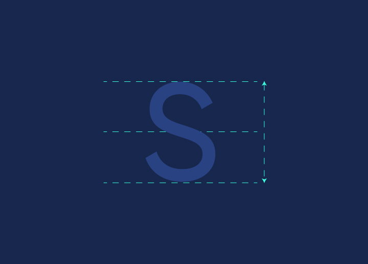
The cap height is the distance between the baseline and the top of the uppercase letters. This is an essential measurement in web design because it helps to determine the size of headings and other text elements.
The baseline is the imaginary line where most letter shapes sit. The x-height is the distance between the baseline and the top of lowercase letters (excluding any ascenders or descenders). This measurement is essential for determining the readability of text.
The ascender/descender height is the distance between the x-height and either the highest point of an ascender (the part of a letter that extends above the x-height) or the lowest point of a descender (the part of a letter that extends below the x-height). This measurement can be important for determining vertical spacing in text elements.
Importance of Cap Height in Web Design
The cap height of a typeface is the distance from the baseline to the top of the capital letters. This is an essential measurement in web design because it helps to create a consistent vertical rhythm across your web pages.
When all of the text on your page has the same cap height, it creates a visually pleasing and easy-to-read experience for your readers. This is especially important in long-form articles or blog posts, where you want your readers to be able to scan the text and pick out essential information quickly.
While you can technically set any cap height you want in your web design, there are some general guidelines that you should follow. A good rule of thumb for body copy is to use a cap height of around 50-60% of the font size. So, if you’re using a 16px font size, aim for a cap height of 8-10px.
You can go slightly higher with the cap height, around 70-80% of the font size for headings and other larger text elements. This will help make your titles stand out more and impact them more.
Ultimately, experimentation and testing come down to finding the right cap height for your web design. Try out different values and see what looks best on your pages. And don’t be afraid to break away from the convention if you think it will result in a better user experience for your visitors.
Best Practices for Using Cap Height in Web Design
When it comes to using cap height in web design, there are a few best practices to keep in mind. First and foremost, always use the same cap height for all text elements on a page. This will create a consistent visual hierarchy and make it easy for users to scan the page.
Another critical best practice is using a large enough cap height to make the text legible. A good rule of thumb is to use a minimum of 12px for body text and 14px for headings. Finally, be sure to consider the overall design of the page when choosing a cap height. For example, a larger cap height may look out of place on a minimalist page.
Conclusion
The cap height is an essential element of web design that helps create a consistent and aesthetically pleasing look on your website. By understanding the importance of cap height and how it can be used to achieve different effects, you can ensure that your site looks great no matter what device or browser it is viewed on. When designing with type, keep these guidelines in mind to help create a pleasant user experience for all visitors to your website.