


Think about the last time you visited a website and instantly knew where to look, what to click, and how to find exactly what you needed. Chances are, that seamless experience wasn’t an accident—it was the result of careful design, with visual hierarchy at its core.
Visual hierarchy is the silent director behind every great website, orchestrating where your eyes go first, what stands out, and what fades into the background. It’s not just a website design principle; it’s the key to making your website intuitive, user-friendly, and ultimately, successful. Without it, even the most beautiful sites can leave visitors feeling lost and overwhelmed.
Why Your Website Needs Visual Hierarchy (Hint: It’s Not Just for Looks)
Think of your website as a map. Without clear markers and directions, visitors can easily get lost, frustrated, and leave before finding what they came for. Visual hierarchy is that map—it organizes your content in a way that naturally leads the eye from one element to the next, ensuring users know exactly where to focus.
But it’s more than just aesthetics. Visual hierarchy is about usability and effectiveness. It helps you prioritize the most important design elements on your page, guiding visitors toward your goals, whether that’s making a purchase, signing up for a newsletter, or simply staying on your site longer. When done right, visual hierarchy turns a good design into a powerful tool for engagement and conversion. It’s the subtle art of directing attention, keeping users on track, and ultimately, making your website work harder for you.
Master the Art of Visual Impact with Seahawk!
Don’t let your website be just another face in the crowd. At Seahawk, we specialize in crafting websites that command attention and engage visitors from the first glance.
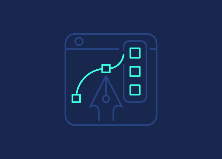
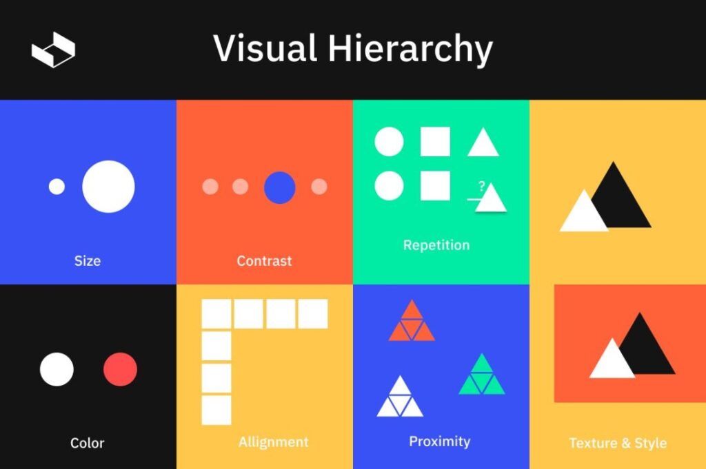
The Art of Grabbing Attention: Essential Elements of Visual Hierarchy
Source: Interaction Design Foundation
Visual hierarchy is all about leading your visitors’ eyes to where you want them to go first. It’s the art of grabbing attention and guiding it naturally, ensuring that the most important elements on your page don’t just blend in—they stand out.
Size Matters: Make a Statement
Imagine shouting in a crowded room—you’ll get noticed, right? On your website, bigger elements = louder voice. Whether it’s a bold headline, a prominent call-to-action button, or a large, captivating image, size naturally draws the eye and commands attention.
Take a look at sites like Apple or Spotify; they use oversized visuals and bold text to direct your focus immediately, making sure you don’t miss what’s most important. Whether they’re screaming with a massive banner or whispering with a subtle, oversized logo, the message is clear: size matters.
Also Read: Best Website Redesign Services
Color Contrast: The Pop Factor
Visualize color contrast as the magnetic force on your web page, pulling attention exactly where you want it, much like a neon sign cutting through the dark.
Look at how Airbnb’s bright call-to-action buttons stand out against a minimalist background, making them impossible to miss. Or observe Slack’s use of contrasting colors, which not only injects energy into the interface but also ensures clarity and ease of interaction. These thoughtful color choices can transform a design from ordinary to extraordinary, turning a plain layout into a visually captivating experience.
Learn: Best White Label Website Design Agencies
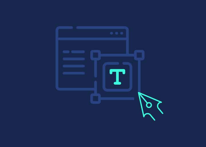
Typography: The Personality of Your Words
Fonts are like fashion for your text—some scream, some whisper. They set the tone and convey emotion even before the words are fully read. Let’s dive into how to dress your words with style.
Consider the difference between using a bold, edgy font like Impact versus a classic, elegant typeface like Times New Roman. The former gives your content a punchy, modern vibe, while the latter exudes tradition and seriousness. Or take Comic Sans, a font that instantly makes any message feel playful (sometimes unintentionally so!). These quirky font choices can completely shift the mood of your website, showing just how powerful typography can be in shaping user perception.
Learn: Responsive Design Beyond Mobile
Whitespace: The Unsung Hero
More like ‘Wow’ space! Whitespace isn’t just empty—it’s the breathing room that makes everything else look good. It’s the subtle element that brings clarity, focus, and elegance to your design.
Take a look at the simplicity of Google’s homepage, where whitespace reigns supreme, allowing the search bar to stand out effortlessly.
Or check out Apple’s product pages, where ample spacing lets each product shine without overwhelming the viewer. These clean designs demonstrate how mastering the art of spacing can elevate your website from cluttered to classy, making it easier for users to navigate and appreciate your content.
Further reading: Vital Elements of a Custom WordPress Design
Design Tricks That Speak Louder Than Words
In web design, subtle techniques can have a big impact on how users interact with your content. These design tricks help communicate your message clearly, without saying a word, guiding users through your site with ease.
The F-Pattern and Z-Pattern: Your Users’ Go-To Moves
Your visitors have habits, and their eyes naturally follow certain paths when scanning a webpage. Understanding the F and Z patterns is like learning their dance moves, allowing you to guide them smoothly through your content.
Websites like The New York Times leverage the F-pattern, where users first scan horizontally across the top, then down the left side, capturing headlines and key images. This layout ensures that the most important information is seen first.
On the other hand, Apple’s product pages often use the Z-pattern, leading the eye from a top banner across to a call-to-action, then diagonally down to more details. These patterns are not just design choices—they’re powerful tools to make sure your visitors don’t miss what matters most.
Layering and Depth: Adding a Little 3D Magic
Layering in web design creates a sense of depth, almost like giving your website a touch of 3D magic. It’s about making elements stand out by adding dimension, which can make your site feel more dynamic and engaging.
For example, websites like Dropbox use subtle shadows and overlapping elements to create a layered effect, making buttons and images appear as if they’re popping off the screen. This technique not only enhances visual appeal but also helps guide the user’s attention to key areas of the page.
Directional Cues: Nudging Users the Right Way
Arrows, lines, even a strategically placed image—these cues act like little nudges, gently directing your visitors’ attention where you want it to go. They’re subtle yet effective tools that say, “Hey, look here!”
Clever uses of directional cues can be seen on sites like HubSpot, where arrows and lines guide users from one section to the next, making navigation intuitive and effortless. These visual hints function like a friendly tour guide, ensuring your visitors don’t miss the important stuff.
Avoid Common Visual Hierarchy Mistakes
Even with the best intentions, it’s easy to make mistakes in visual hierarchy that can confuse or overwhelm your visitors. Here are two common pitfalls to watch out for.
When Everything Is Important, Nothing Is
If you try to make every element on your page stand out, nothing will. When everything screams for attention, users won’t know where to focus, leading to confusion and frustration. Prioritize the most critical elements to guide your visitors smoothly through your content.
Mobile Mayhem: Don’t Forget the Little Guys
A design that looks great on a desktop might fall apart on mobile if hierarchy isn’t carefully adjusted. Mobile users have different needs and limited screen space, so ensuring your visual hierarchy translates well to smaller screens is essential. Simplify and prioritize key elements to keep the mobile experience just as effective.
Read More: WordPress Website Design: Reasons to Hire a Professional Agency
Practical Tips That You Can Start Using to Design Like a Pro
Creating a strong visual hierarchy doesn’t have to be complicated. Here are some practical tips to help you design like a pro.
Focus on What Matters Most (Hint: It’s Not Everything)
Not everything on your page deserves equal attention. Identify the key elements—like your call-to-action or main message—and make them the focal points. Let the less critical details take a backseat to avoid overwhelming your visitors.
Learn More: Best Startup Websites & Designs in WordPress
Get Feedback: Your Users Are Your Best Critics
No matter how well you think you’ve nailed your design, real users can offer insights that you might miss. Conduct user testing or gather feedback to see how effectively your visual hierarchy guides them. Their input can help you fine-tune your design for better results.
Embrace Simplicity: Less Really Is More
A cluttered page can confuse users and dilute your message. By embracing simplicity, you allow your most important elements to shine. Keep your design clean, and remember that sometimes, less is more when it comes to guiding your visitors’ attention.
Learn More: Best Sites to Hire WordPress Developers & Designers
Wrapping It Up: Your Blueprint for a Visually Stunning Website
Bringing it all together, a well-crafted visual hierarchy is the foundation of any successful website. By focusing on what truly matters, guiding users with clear visual cues, and keeping your design clean and simple, you can create a site that not only looks stunning but also functions seamlessly.
Remember, a visually stunning website isn’t just about aesthetics—it’s about enhancing the user experience, making navigation intuitive, and ensuring your visitors find what they need quickly and easily. Use these principles as your blueprint, and you’ll be well on your way to designing a site that captivates and converts. Now, it’s time to put these tips into action and watch your website transform!