


Design alignment is about creating a sense of order and visual stability in your design. It’s the process of deliberately lining up elements on your page, so they feel unified and cohesive.
Good alignment gives your design a clean, organized look. It helps lead the eye smoothly through the composition, making even the most complex designs feel simple and streamlined.
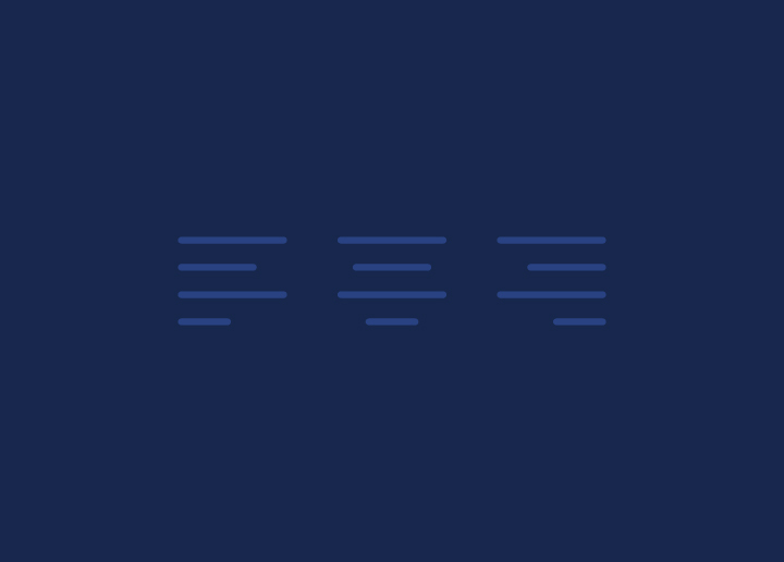
There are four main types of alignment: center, left, right, and justified. Center alignment is the most common type of alignment used in design. It creates a sense of balance and symmetry and is often used to create formal or traditional compositions.
Left alignment is most commonly used for body copy in books and magazines. It creates a clean, easy-to-read look that feels open and airy. Proper alignment is less common in design but can create more dynamic compositions. Justified alignment is often used in editorial design to create columns of text that are flush with both the left and right margins.
An alignment is an essential tool for any designer to master. By understanding how to use it effectively, you can create harmonious layouts that feel orderly and balanced.
Principles of Alignment
There are three fundamental principles of alignment in design: proximity, balance, and hierarchy.
Proximity refers to the closeness of elements in a design. When elements are close together, they are perceived as being related. This is why grouping similar items (such as all the navigation links in a header) can help create a cohesive layout.
Balance is the distribution of visual weight within a design. Symmetrical balance is achieved when elements are evenly distributed on either side of a center point. Asymmetrical balance occurs when the visual weight is not evenly distributed; this can create a more dynamic and interesting layout.
Hierarchy refers to the order in which information is presented. Using different levels of hierarchy, you can control how users interact with your design. For example, you might use more extensive, bolder text for headlines and smaller, subdued text for body copy.
Reasons Why Alignment Matters
There are many reasons why alignment matters in design. Perhaps the most obvious reason is that it creates a sense of order and harmony in a design. When elements are correctly aligned, they appear organized and intentional, giving a design a professional and polished look.
In addition to creating visual appeal, alignment can help create a more user-friendly design. If elements are correctly aligned, they are easier to scan and digest, making for a better user experience. Good alignment can also help direct the eye toward the essential design elements, such as calls to action or critical pieces of information.
Alignment is a good habit when creating any design. You can create aesthetically pleasing and functional layouts by following simple alignment principles. So next time you’re working on a design project, take some time to consider your alignments – it could make all the difference in the result!
Tips and Tricks for Good Layout Alignments
1. Use a grid: A grid is an invisible system of horizontal and vertical lines that you can use to align your content. By creating a grid, you can ensure that your content is evenly aligned across the page.
2. Use white space: White space is the space on a page. You can create visual balance and harmony in your layout using white space.
3. Use typography: Typography is the art of working with typefaces or fonts. You can create visual interest and hierarchy in your layout using different fonts.
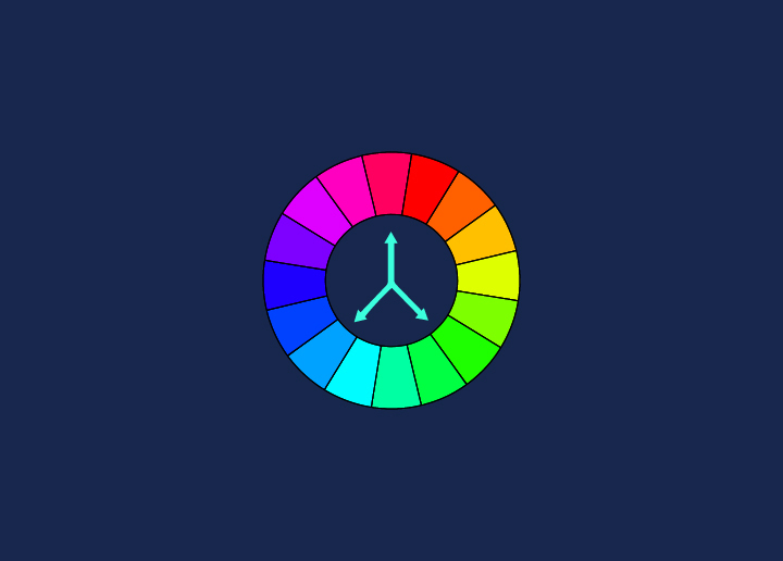
4. Use color: Color can create visual interest, contrast, and hierarchy in your layout.
5. Use imagery: Imagery can add visual interest and contrast to your layout.
Conclusion
Alignment is an essential concept in design that can be used to create visually pleasing and harmonious layouts. With the right combination of elements, you can use alignment to draw attention to specific areas of your design while ensuring that all components are correctly spaced out not to overwhelm users. Remember these tips when working on your next project, and you’ll be sure to create a stunning and unified layout!
For effective & top website designing solutions, contact us!