Designing a WordPress dashboard can be a bit like organizing your favorite workspace—a place where everything you need is easily accessible and nothing gets in your way. When you get it right, it feels intuitive, efficient, and even enjoyable to use! Whether you’re a seasoned web designer or just getting started, knowing the do’s and don’ts of dashboard design can make all the difference.
From prioritizing user experience to avoiding clutter and confusing navigation, this quick guide will walk you through the essentials to ensure your dashboard is both friendly and functional. Let’s dive in!
Importance of WordPress Site Dashboard
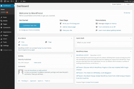
The WordPress dashboard is the first thing you see when you log in—it’s like the control center for your website. Whether you’re managing content, customizing your site’s look, or dealing with maintenance tasks, the dashboard is where it all happens.

Let’s explore why the dashboard is so crucial:
- Central Hub for Website Management: The dashboard serves as the nerve center of your website, allowing you to manage posts, pages, comments, and more—all in one place. Its intuitive interface helps you easily navigate through various features.
- Customization and Personalization: With its customizable layout, the dashboard lets you tailor your workspace to fit your needs. You can add widgets, rearrange elements, and configure settings to streamline your workflow.
- WordPress Plugin and Theme Management: The dashboard provides easy access to WordPress theme and plugin management, allowing you to install, update, and configure third-party tools that enhance your site’s functionality and appearance.
- Security and Performance Monitoring: Through the dashboard, you can keep tabs on your site’s security and performance. Important updates, security alerts, and analytics are readily available to help maintain your site’s health.
- User Experience Enhancement: A well-designed dashboard improves the user experience by making complex tasks simpler and faster to execute in just a few clicks. It’s key in encouraging both beginners and experienced users to interact efficiently with their websites.
Learn about: Ways to Speed Up Slow Admin Dashboard
Transform Your Site Now: Let Us Enhance Your WordPress Dashboard Design!
Our team will streamline your interface, improve usability, and tailor the dashboard to fit your unique needs. Start transforming your site today!
Do’s for WordPress Dashboard Design
WordPress dashboard design involves several key practices to ensure it is user-friendly, efficient, and meets the requirements of those who use it. Let’s dive into the essential do’s:
Gather Essential Information for Designing Dashboards
Before diving into the design phase, it’s crucial to collect key information that will guide the creation of a user-centric dashboard. This groundwork ensures the dashboard is both practical and effective for its intended users. Here’s how to gather and apply this essential information:
- Conduct User Research: Start by conducting user research to understand your target audience’s needs, preferences, and behaviors. This insight is foundational for designing dashboards that truly meet users’ needs and improve their experience on a WordPress website.
- Design with User Needs in Mind: When designing WP dashboards, focus on supporting users in achieving their goals. Consider the user profiles, specific goals, and constraints such as limited space on mobile devices to ensure the dashboard is both functional and user-friendly.
- Use Progressive Disclosure: Apply the principle of progressive disclosure to manage user mental load. Present summarized information initially and allow users to access more detailed data with additional interactions, keeping the interface clean and manageable.
- Prioritize Important Information: Identify and prioritize important information, making it easily accessible and visually prominent. Utilize graphics and charts to facilitate quick interpretation and understanding of information.
- Consider SEO in Design: Take search engine optimization (SEO) into account during dashboard design to enhance the website’s loading speed and overall performance. A well-optimized dashboard not only appeals to users but also improves the website’s efficiency and functionality.
Guide to: White-Label WordPress Admin Dashboard
Setting Dashboard Goals and Displaying Data
Effective dashboard design begins with clear goals that focus on solving specific problems. This structured approach ensures that the dashboard delivers meaningful data to its users.

Here’s how to set goals and display data effectively:
- Define Clear Goals: Start by establishing a well-defined set of user’s goals, concentrating on the central problems to solve and the vital insights users need to derive from the data. This clarity drives the overall design process and helps create focused outcomes.
- Use the S.M.A.R.T Framework: Adopt the S.M.A.R.T framework for setting goals, ensuring they are specific, measurable, actionable, realistic, and time-based. This structured approach guides the design process and ensures goals are achievable and impactful.
- Identify Relevant KPIs: Determine the key performance indicators (KPIs) that align with the user’s objectives. Display these prominently on the dashboard to provide immediate access to critical information and enhance decision-making capabilities.
- Leverage Google Analytics: Incorporate insights from Google Analytics to inform design decisions, ensuring the dashboard displays the most pertinent and valuable data. This ensures the dashboard remains relevant and user-focused.
- Select the Right WordPress Theme: When choosing a WordPress theme, free or premium, consider the user’s specific needs and goals. The right theme supports effective data display and aligns with the overall dashboard objectives while enhancing usability and aesthetics.
Find out: How to Fix Broken CSS in the WordPress Admin Dashboard
Organizing Dashboard Content with Progressive Disclosure
Streamlining dashboard content to show only the most relevant data enhances user experience by minimizing complexity and improving clarity.

Here’s how to organize content:
- Display Relevant Data: Focus on presenting only the most pertinent information. Overloading the dashboard with excessive data makes it difficult for users to locate what they need, hindering usability and efficiency.
- Reduce Complexity and Enhance Clarity: Simplify the dashboard’s structure to guide design decisions. Clarity should be paramount, ensuring that users can easily navigate and comprehend the information presented.
- Offer Customizable Themes: Consider incorporating customizable themes that empower users to personalize their dashboard experience. This flexibility accommodates diverse user preferences and enhances engagement.
- Incorporate Animation: Use animation strategically to meet various user needs and perform multiple functions. Animations can guide users, provide feedback, and improve overall interaction by making the dashboard more intuitive and engaging.
Also read: How to Customize WooCommerce Dashboard
Customizing the Dashboard for User Needs
Tailoring the WordPress dashboard to meet specific user needs can significantly enhance its effectiveness and usability. Customization helps create a more organized and efficient workspace.

Here’s how you can customize the dashboard:
- Organize and Simplify: Customize your WordPress admin dashboard by hiding unnecessary items and adjusting admin screens. This creates a more organized and efficient workspace, allowing users to focus on what matters most.
- Streamline Site Management: Reduce clutter and improve navigation by streamlining the WordPress dashboard. Simplifying site management tasks helps users work more effectively and minimizes time spent searching for tools or features.
- Tailor Admin Menus: Learn how to modify admin menus and more to align the dashboard with your specific needs. Tailoring these elements ensures that essential tools and functionalities are easily accessible.
Simple Guide: How to Add or Change WordPress Admin Icons
Designing a User-Friendly and SEO-Friendly Dashboard
Creating a user-friendly and optimized dashboard for search engines is crucial for enhancing user experience and boosting website performance. Here’s how to achieve this balance:
- Ensure Mobile Compatibility: Design with mobile devices in mind to ensure the dashboard is mobile-friendly and easily accessible. This adaptability enhances user experience across different devices and screen sizes.
- Maintain a Clean Design: Use a clean and straightforward design to minimize users’ cognitive load and reduce the time spent searching for information. A simple layout improves usability and makes navigation intuitive and efficient.
- Incorporate SEO Considerations: Consider the importance of SEO in dashboard design to enhance the website’s loading speed and improve search engine rankings. An optimized dashboard not only benefits users but also enhances the site’s overall performance.
- Use Plugins Wisely: Use premium and free plugins judiciously to avoid slowing down the website. Select essential plugins that offer value without compromising speed.
Bonus: Best Practices for Dashboard Design
Implementing best practices in dashboard design ensures that the final product is not only effective but also widely accepted by its users. Here are some additional strategies to elevate your dashboard design:
- Engage in Iteration and Feedback: DO try-it-out, redo, and actively seek feedback to ensure your dashboard meets user expectations. Gathering solid feedback from the audience is crucial for acceptance and continuous improvement.
- Personalize for the Audience: DO consider the audience and make the dashboard personal by aligning it with their specific objectives and needs. Tailoring the dashboard ensures relevance and enhances user engagement.
- Maintain Consistency and Accessibility: DO ensure consistency across the dashboard design and enhance accessibility. This approach guarantees a seamless user experience and makes the dashboard usable for all audiences, including those with disabilities.
- Draw Inspiration from Various Industries: DO take inspiration across businesses and industries to build a powerful dashboard that stands out and makes an impact. Learning from diverse examples can spark creativity and innovation.
- Use BIG Numbers for Impact: DO use BIG numbers to capture the audience’s attention and influence their usage behavior. Large, prominent figures help convey key messages quickly and effectively.
- Focus on Core Questions: DO focus on the top three questions you want to be answered when viewing the dashboard. Use a drill-through hierarchy to hide additional information, ensuring that the primary dashboard remains uncluttered and focused.
Further reading: Mastering Minimalist Design to Elevate Your Website’s Aesthetic
Don’ts for WordPress Dashboard Design
Creating a successful WordPress dashboard requires avoiding many common design pitfalls. Keeping these “don’ts” in mind will help maintain a user-friendly and effective interface.
Disregard Aesthetics
Don’t underestimate the impact of design aesthetics. An unattractive or outdated dashboard can deter users and leave a poor impression. Ensure your design is clean, modern, and visually appealing. A well-designed aesthetic contributes to better user engagement and creates a more pleasant and intuitive experience, reinforcing trust and professionalism.
Overuse Colors and Graphics

DON’T become a design freak by over-coloring or over using graphic elements in the dashboard. Excessive use of colors and graphics can create visual clutter, making it hard for users to read and understand the information presented. Use a simple and consistent color scheme to maintain readability.
Check out: Color Trends and Strategies
Clutter Your Dashboard
Avoid overwhelming users with a cluttered dashboard filled with too many widgets and information. Clutter makes it difficult for users to find critical features and data, leading to frustration and reduced efficiency. Focus on simplifying the interface by prioritizing essential elements and information, thus improving navigation and user satisfaction.
Overwhelm with Information
DON’T try to answer every question at once. Overloading the dashboard with too much information can make it difficult for users to read and analyze data effectively. Focus on presenting key insights and allow users to drill down for more details if needed.
Ignore Security Settings

Never disregard the importance of security settings in your dashboard design. Security lapses can expose your site and user data to threats and vulnerabilities. Ensure security features are comprehensive and easy to manage. Regular updates, strong user authentication, and configurable security settings are vital to maintaining a secure environment.
Overuse Plugins
Using too many plugins can significantly slow down your dashboard and introduce compatibility issues. Limit plugin use to those that are truly essential for functionality. Evaluate each plugin’s necessity and potential impact on performance to keep the dashboard running smoothly and efficiently.
Use Complex Navigation
Steer clear of complex navigation structures that can confuse users. Intricate or deeply nested menus make it hard for users to locate features swiftly. Implement straightforward and intuitive navigation practices, such as clear labels and logical menu hierarchies, to enhance user experience and ease of access.
Ignore Screen Size Considerations
DON’T forget to estimate screen size, especially on mobile devices. A dashboard that looks cluttered on smaller screens can frustrate users and hinder usability. Design responsive dashboards that adjust smoothly to various screen sizes, ensuring a seamless experience.
Assume Users Don’t Need Guidance
DON’T assume the audience inherently have the technical knowledge or knows how to navigate the dashboard. Users often need guidance, so incorporate tooltips and wizards to assist them. These aids help users explore the dashboard’s features and functionalities, improving their overall interaction and satisfaction.
Further reading: Best Ways to Use Geometric Shapes in Web Design
Conclusion and Final Tips
Dashboards are powerful tools for communicating data and insights, particularly when designed with a user-centered, goal-driven approach. Embracing WordPress dashboard design best practices and effective data visualization principles is key. By adhering to these foundational guidelines and examining practical examples, you can craft exceptional dashboard layouts tailored to various needs.
Always remember to test your dashboard with real users to gather valuable feedback, which will drive continuous improvements and refinements. Also, don’t shy away from iterating on the design; making adjustments is essential for enhancing usability and effectiveness.
Additionally, recognize the crucial role of WordPress development and web design in crafting a dashboard that is not only user-friendly but also optimized for SEO. These elements ensure your dashboard is accessible, engaging, and high-performing.
WordPress Dashboard Design FAQs
How do I customize my WP dashboard?
To customize your WordPress dashboard, adjust admin screens, hide unnecessary items, tailor admin menus, and use plugins for further personalization and enhanced functionality.
What are the don’ts of dashboards?
Avoid cluttering the interface, overusing colors and graphics, relying on a single chart type, ignoring mobile responsiveness, and assuming users won’t need guidance.
What is the 5 second rule for dashboards?
The 5-second rule suggests that users should be able to understand a dashboard’s main purpose and insights within five seconds, emphasizing clarity and focus.
What makes a good dashboard design?
A good dashboard design is user-centric, goal-oriented, visually clear, and responsive. It also utilizes effective data visualization to convey insights quickly and accurately.


