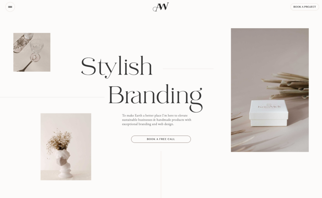
A simple website doesn’t mean boring—it means intentional. Minimalist design principles focus on eliminating clutter, using ample white space, and creating a seamless user experience that captures the user’s attention from the moment they land on the home page.
Minimalist website design is all about simplicity. It focuses on using only the essential elements to create a clean, functional, and visually appealing interface.
However, it’s not so simple. Although minimalism cares about simplicity, also strategic and properly planned and placed.
Whether that could be through WordPress website design or made through an agency, everything needs to be strategic.
Incorporating minimalist principles into your website design can significantly enhance its user-friendliness and overall aesthetic. This guide will walk you through the key principles and practical steps to master minimalist design for your website.
Key Principles of Minimalist Design

Minimalism is broad and varied in terms of industry and designer. But there are certain key principles that a minimalist design adheres to for it to be considered minimalist.
If you satisfy these criteria, then your minimalist approach might be effective.
Color scheme: A simplified color palette is crucial in minimalist design. Limiting your color scheme to just a few colors that complement each other can create a cohesive and serene visual experience. This approach not only makes your site look polished, but also complement your logo design as well as other design features.
Negative space: Negative space, or white space, is an essential component of minimalist design. It refers to the empty spaces around elements on your page. Proper use of negative space can make your website design look less cluttered and more organized, making it easier for visitors to navigate and find what they need.
Clean typography: A nice typography is another cornerstone of minimalist design. Choosing fonts that are simple and easy to read can greatly enhance the readability of your content. Avoid overly decorative fonts and stick to a few typefaces to maintain consistency throughout your site.
Visual hierarchy: It is about guiding your visitors’ attention to the most important parts of your website.
You can achieve this by using size, color, and placement to highlight key information. A well-defined visual hierarchy helps users understand the structure of your content and navigate your site more efficiently.
Attract Customers with Stunning Minimalist Design
Okay, we get it! You want to enhance your website’s aesthetic and functionality but wondering how? Well, that’s what Seahawk’s designers are here for. Let transform your brand identity today!
Steps to Implement Minimalist Design
Minimalist design can be tricky. But if you’re a beginner to minimalism, there are key steps you can take to get the ball running.
These steps are not exclusive, meaning you can have your own strategy. But these steps ensure that you can build the foundation on which your other creative outputs can layer on top of.
Step 1: Start with Planning and Research
Understanding your target audience and their needs is crucial. Analyze competitor websites to see what works and what doesn’t in your industry. You can even use selenium python to automate this research process and gather data on your competitors which can be used to inform your own strategies. This initial research will inform your design decisions and help you create a site that meets your users’ expectations.
Read More: Best White Label Website Design Agencies
Step 2: Simplify Your Layout
Reduce clutter by removing unnecessary elements and streamlining your navigation. A simple, intuitive layout makes it easier for visitors to find what they’re looking for and improves the overall user experience.
Step 3: Choose a Minimal Color
Choosing a minimal color scheme is essential. Limit yourself to a few colors that work well together and support your brand’s identity. A harmonious color scheme can make your website look more professional and visually appealing.
Step 4: Use White Space
Utilize white space to enhance readability. Proper use of negative space can create a balanced layout and make your content easier to read. It also helps to direct attention to the most important elements on your page.
Step 5: Incorporate Clean Typography
Selecting clean typography is important for readability. Stick to readable fonts and maintain consistency in font styles throughout your website. This will make your content more accessible and enhance the overall aesthetic of your site.
Step 6: Make Your Content Minimalist too
Prioritize your content by highlighting essential information. Use images and other visual elements purposefully to support your content. This ensures that your visitors can easily find and focus on what’s most important.
Minimalist Website Design Examples That Prove Less is More
Minimal web design is an art—it’s about stripping away the unnecessary and focusing on what truly matters. A functional design that emphasizes simplicity, ample white space, and bold typography creates a seamless experience that captures the user’s attention without distractions.
Some of the most successful brands in the world have embraced minimalist design principles, proving that sometimes, less is more. Let’s take a look at real-world examples of websites that have mastered the art of minimalism.
Create a Stunning Minimalist Website with Expert Design!
Let our web design experts craft a sleek, high-performing website that aligns with your brand. Contact us today to get started!
Airbnb – The Power of Space and Simplicity

Ever noticed how effortless it is to browse Airbnb? That’s the magic of a minimalist website example done right. The home page welcomes you with large images that immediately transport you into a world of travel possibilities.
With a neutral color palette and a clean, transparent navigation bar, Airbnb ensures that site visitors focus on their next adventure rather than on cluttered design elements. The space surrounding each component makes browsing feel effortless, proving that a simplistic design can be both beautiful and functional.
What makes it stand out? A perfect balance of white background, high-quality visuals, and an intuitive interface.
Apple – Where Minimalism Meets Perfection

Apple has long been a perfect example of minimal web design. From its products to its website design, everything is meticulously crafted with intention.
The black typography on a crisp white background, combined with large images, ensures that the focus remains on the latest Apple innovations. There’s no unnecessary fluff—just a visually captivating layout that lets the products speak for themselves. The footer features simple yet essential page links, keeping the site clean and easy to navigate.
What makes it stand out? A true masterclass in minimalism, making the user experience feel effortless.
Dropbox – Functionality with a Minimalist Touch

Dropbox is the dream website for those who appreciate clean and structured layouts. With sans serif fonts and a monochromatic color scheme, the design stays sleek while delivering a highly functional experience.
Rather than overwhelming the user with excessive design elements, Dropbox relies on ample white space and a well-structured landing page to keep everything streamlined. The hamburger menu icon neatly tucks away the navigation options, keeping the focus on Dropbox’s core offering—secure and easy file storage.
What makes it stand out? A simple yet effective design that blends form and function effortlessly.
Squarespace – A Minimalist’s Playground

If you’re a web designer looking for inspiration, Squarespace is a minimalist website example worth studying. The hero section uses animated text to introduce its services, creating an engaging experience while maintaining an elegant aesthetic.
With a black background and carefully curated other elements, Squarespace achieves a simplistic design that resonates with creative professionals. The footer features neatly arranged page links, keeping everything accessible without disrupting the overall aesthetic.
What makes it stand out? A flawless blend of bold typography, neutral colors, and smooth transitions.
Everlane – The Minimalist E-Commerce Experience

Everlane proves that a minimal website can be just as effective for online shopping. The home page uses high-quality images and black typography on a white background, keeping the focus on their ethically sourced clothing.
With a strategically placed hamburger menu icon, the navigation remains simple, ensuring a seamless shopping experience. The space surrounding the products enhances their visual appeal, while the navigation bar keeps the shopping journey smooth and distraction-free.
What makes it stand out? A simple web design that allows the products to take center stage.
Tools and Resources to Activate Minimalism

Now that tools abound, don’t make your design process even more difficult and complicated than it can be. Some tools are perfect for inspiration and sketching, if not for actual design.
For inspiration, perfect are the social media platforms like Instagram, TikTok, and Snapchat. This helps your gear run smoothly. You can also understand your target audience from here, your competitors, as well possible design similarities.
For the actual design process, use design software like Adobe XD or Figma. These tools offer great features and range for creating and testing minimalist designs. However, they may not be for beginners and the learning curve is steep.
Learn How-to Convert: Figma to WordPress
You can try using web design templates and go from there. There are so many platforms that offer drag and drop features and easy-to-download templates. They provide a range of templates and design elements that can help you get started.
Look for inspiration from example sites. Websites like Awwwards showcase excellent minimalist designs that can spark your creativity and give you ideas for your own site. Analyzing these examples can help you understand how minimalist principles are applied in real-world designs.
Consider tutorials and courses to improve your skills. Platforms like Udemy offer courses on minimalist web design that can help you learn the ins and outs of this design style. Continuous learning is key to mastering minimalist design.
Test and Analyze the Performance of Your Sites
User testing is essential to ensure your minimalist design is effective. Gather feedback from real users to understand how they interact with your site. This feedback can reveal areas that need improvement and help you make necessary adjustments.
Testing helps ensure your design is effective and user-friendly. For instance, check out these stats on user testing benefits. Regular testing and iteration are crucial for maintaining a high-quality user experience.
A/B testing is one of the most effective website tests you can do for user interface and user experience. This is also particularly helpful for minimal interfaces. If you’ve implemented any form of design approach, you need to add one more for two variations. And then implement these designs in different pages, maybe at different time frames, or maybe for different target audiences. Then see how different the performances are. Overtime, you can definitely tell which approach works better.
Wrapping up
Minimalist design is one of many branding ideas for your websites. One that offers so many benefits. It makes your website clean, functional, and visually appealing. Embracing minimalism can lead to a better user experience and a well-branded website.
Remember, less is more! For more on the benefits, read this article on the power of minimalism. Happy designing! Ready to transform your website with a minimalist approach? Explore our professional website design services and let’s create something amazing together!


