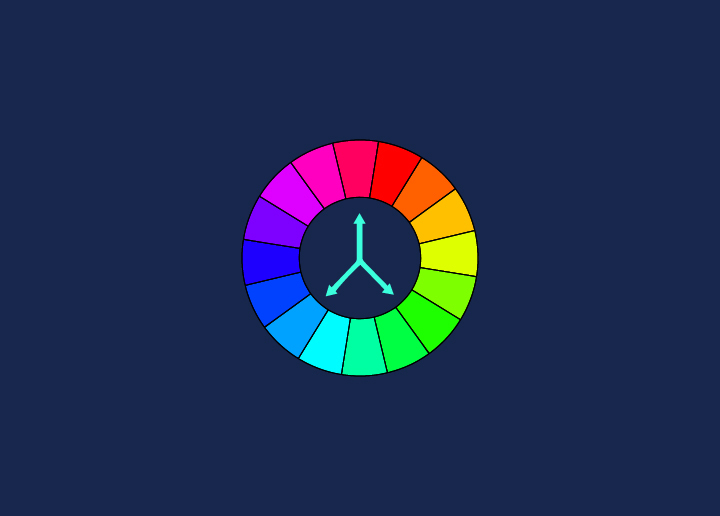


Negative space plays an essential role in the design and can be used to create visual interest, balance, and contrast. It is the space surrounding a design, whether a webpage or a single image. When used effectively, negative space can help to draw the viewer’s attention to essential elements of a design.
Negative space can be created using various techniques, including placing objects within the frame, using white space, and using color. Designers can create visually appealing and functional compositions by carefully considering the negative space in a design.
Benefits of Utilizing Negative Space in Design
When it comes to design, utilizing negative space can be highly beneficial. For starters, it can help to create a more visually appealing overall design. Additionally, negative space can help to highlight some aspects of a design, making them more noticeable and impactful. Finally, using negative space wisely can also help to create a sense of balance within a design, which is often essential for achieving an aesthetically pleasing final product.
How to Use Negative Space Effectively?
Negative space, also called white space, is the area around the main subject in a design. It can create balance, contrast, and visual interest in a design. Negative space can make a design more aesthetically pleasing and easier to understand when used effectively.
When creating a design, it is crucial to consider the negative space and how it can improve the overall composition. Here are a few tips for using negative space effectively:
1. Use negative space to create balance.
If there is too much positive space (occupied by the main subject), the design will look unbalanced and busy. Adding more negative space can help to create a sense of balance.
2. Use negative space to add contrast.
Adding contrast can make a design more visually attractive. Negative space can create contrast by making the main subject stand out against a background of positive space.
3. Use negative space to add visual interest.
Negative space can add visual interest by creating shapes and patterns within the empty areas of a design. This can help break up large areas of positive space and make the overall composition more interesting.
Examples of the Use of Negative Space
Negative space is used in graphic design for the space surrounding an object. It’s often considered white space but can be any color, including black. Negative space plays a vital role in the design and can be used to create balance, contrast, rhythm, and harmony.
Negative space can be used in many designs, from web pages to logos to single images. Let’s look at examples of how negative space is used effectively in design.
Web Pages
One common way to use negative space on a web page is to group related elements and leave plenty of space around them. This allows users to scan the page and find what they want quickly. Another way to use negative space on a web page is to create contrast between different elements. For example, you might put a dark-colored element on a light-colored background or vice versa. This can help draw attention to specific parts of your web page.
Logos
Many logos effectively use negative space by incorporating it into the overall design. For example, the FedEx logo uses negative space to create an arrow between the E and the X. The Nike swoosh logo is another excellent example of how negative space can be used effectively in a logo design.
Single Images
Negative space can also be used effectively in single images. One way to do this is by using leading lines that lead your
Conclusion
Negative space is an integral part of the design, as it helps to create balance and harmony while also drawing attention to the main elements in a composition. Whether used subtly or boldly, negative space can be used to significant effect when designing a webpage or image. When used correctly, this technique can help highlight key elements and improve the overall aesthetic of your design. So if you’re looking for ways to ensure your website or image stands out from the crowd, try experimenting with different uses of negative space!
Looking for professional web designing services? Head to Seahawk!