Saturation is the intensity of a color. The higher the saturation, the more vibrant the color. The lower the saturation, the more muted the color.
Saturation is an essential factor in web design because it can help create a certain mood or feeling. For example, using highly saturated colors can give a website an energetic feel, while using low saturation colors can make a website feel more calming and relaxed.
When choosing colors for your website, you’ll want to consider saturation and hue (the actual color) to create the desired effect.
How Does Saturation Affect Color in Web Design?
Saturation is a measure of how pure a color is. The more saturated a color, the more vibrant it appears. The less saturated a color, the more muted it seems.
Saturation is an essential consideration in web design because it can significantly impact the overall look and feel of a site. Too much saturation can make a site look garish, while too little can make it dull. Finding the right balance of saturation can be tricky, but it’s worth taking the time to get it right.
The Impact of Different Levels of Saturation
When it comes to color, saturation is one of the essential properties. Saturation describes how bright or intense a color is. The higher the saturation, the more vibrant the color will be. The lower the saturation, the more muted the color will be.
Saturation is measured on a scale from 0% to 100%. A value of 0% means a color is wholly desaturated or gray. A value of 100% means a color is fully saturated or as bright as it can be. Most colors you see in nature and everyday life fall between these extremes.
The level of saturation can have a significant impact on how your design is perceived. High-saturation colors are often associated with energy and vibrancy, while low-saturation colors are often seen as calming and relaxing. The right saturation level can help create the mood you want for your design.
Too much saturation can be overwhelming, however, so it’s essential to use it sparingly. A little bit goes a long way when adding pop to your design.
Tips for Using Saturation Effectively in Web Design
Saturation is one of the three properties of color, along with hue and lightness. It is a measure of how pure a color is. The higher the saturation, the more refined the color. The lower the saturation, the more washed out or muted the color.
Saturation is an essential tool in web design. It can create visual interest, draw attention to critical elements, and add vibrancy to a design. When used effectively, saturation can make a design pop and help it stand out.
Here are some tips for using saturation effectively in web design:
- Use saturated colors sparingly. Too much saturation can be overwhelming and jarring. A little goes a long way.
- Use light colors for areas you want people to focus on and dark colors for areas you want people to ignore. This is called contrast, a powerful tool for directing attention.
- Vary the saturation of different elements in your design to create visual interest and balance. A well-balanced design will have a variety of both saturated and unsaturated colors.
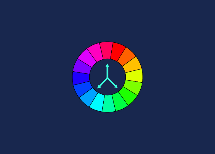
- Use color theory to your advantage. Colors that are opposite each other on the color wheel are called complementary colors. These colors work well together because they create contrast and visual interest.
Conclusion
In web design, saturation is essential to consider when creating a website. It can help add vibrancy and life to the design or be used as part of a more muted color palette for a softer look. When adjusting the saturation levels on your website, always keep in mind how it will affect your site’s overall feel and appearance. With careful consideration and experimentation, you’ll be able to find just the right amount of vibrance that will take your website design from drab to fab!


