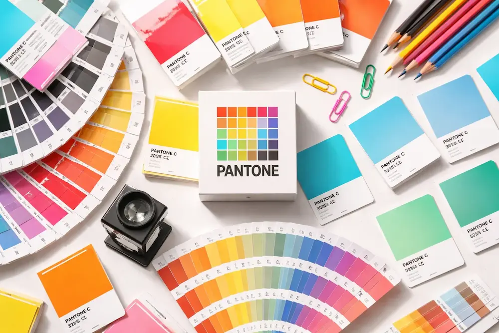
Pantone is a company that creates and maintains color standards for the printing and design industries. The Pantone Matching System (PMS) is a standardized color reproduction system. Using the PMS, designers and printers can accurately match colors when reproducing a design.
PMS is used in various industries, including graphic design, fashion, product design, and manufacturing. Accurate color reproduction is essential to achieving the desired results in each of these industries.
There are two ways to select colors in the PMS: Pantone Color Chips or the Pantone Color Formula Guide.
Pantone Color Chips are physical representations of colors that can be used to select and specify colors for print and design projects. Each chip contains a specific PMS color number and name.
The Pantone Color Formula Guide is a book that contains all the PMS colors, along with their corresponding color values. The guide can be used to select, specify, and match colors for print and design projects.
Types of Pantone Colors and Their Uses
There are two types of Pantone colors: spot colors and process colors. Spot colors are specific, premixed inks that come in various colors. In contrast, process colors are created from a limited number of cyan, magenta, yellow, and black inks, combined to produce a wide range of colors.

Pantone’s spot colors can be either CMYK or Hexachrome, the latter being an expanded six-color palette that includes orange and green. These inks are primarily used for printing on paper and cardboard, although some can also be used for fabric printing. Process Pantone colors, on the other hand, are only used for digital printing.
Pantone’s color matching system is the industry standard for color communication, ensuring that your design will be reproduced accurately, regardless of the medium on which it will be printed. Whether you’re working with spot or process Pantone colors, it’s essential to specify the correct Pantone color code to ensure your design appears exactly as intended.
The Benefits of Pantone Colors
Pantone colors are advantageous for designers because they:
- They are consistent in color and hue from one batch to the next.
- It can be specified by a code, which allows for accessible communication between designers.
- Available in a wide range of colors, this option gives designers plenty of choices to select from.
- It can be used on various materials, including textiles, plastics, and paints.
How to Use Pantone Colors in Design Projects?
When creating a color palette for your design project, there are several approaches you can take. However, if you’re looking for a foolproof method that consistently delivers on-trend, professional results, consider Pantone colors.
Pantone is the world’s leading color authority, and designers across all industries use their expertly curated palettes. Whether you’re working on a branding project or an interior design scheme, incorporating Pantone colors into your design will give it a polished edge.
Not sure how to get started? Here are some tips on how to use Pantone colors in your next design project:
- Use the Pantone Color Bridge set to find similar CMYK and RGB values for each color. This is especially helpful if you’re working with digital media.
- The Pantone Matching System (PMS) is the industry standard for specifying and communicating colors in print designs. If you’re working with a printer, make sure they use PMS inks, so your colors turn out exactly as intended.
- If you want to experiment with bolder, more vibrant hues, try using Pantone’s Fluorescent or Neon ink sets. These inks are unavailable as part of the standard PMS range but can be specially ordered from most printing companies.
- Remember that due to variations in monitor displays, the colors you see on your computer may not exactly match the colors that print out. To ensure accuracy, use a Pantone Color Guide to help you find the closest possible match.
- When selecting colors for your design project, try to create a palette that incorporates both light and dark shades, as well as warm and cool tones. This will help ensure that your design looks balanced and cohesive.
By following these tips, you can confidently select Pantone colors for your next design project and consistently achieve professional results.
Tips for Using Pantone Colors
When selecting colors for your design project, consider a few key factors. Here are some tips for using Pantone colors:

- Use the right tools. Ensure you use Pantone’s official color guide and chips when selecting colors. This will ensure that you’re getting accurate color representations.
- Consider the effect of different lighting conditions. Colors can appear differently under different lighting conditions, so be sure to view them in various lighting conditions before making a final decision.
- Know when to use spot vs. process colors. If printing in CMYK, you’ll want to use process colors. However, you’ll want to use spot colors if printing with Pantone inks.
- Use multiple Pantone colors together judiciously. Too many colors can be overwhelming, so choose a limited palette and stick to it throughout your design.
Pantone Guides and Tools Explained
Pantone colors are more than names and numbers. They are part of a structured color system developed by Pantone LLC and guided by the Pantone Color Institute.
This system enables designers to achieve accurate color reproduction across both physical and digital formats. At its core is the Pantone Matching System, often referred to as PMS. It allows designers to match colors consistently, no matter the material or printing process.
Pantone offers several guides for different needs. The Formula Guide is widely used in print and packaging. It shows how ink behaves on coated and uncoated paper stocks. This helps graphic designers predict how a shade will look in real conditions.
The Color Bridge guide connects Pantone colors to CMYK and RGB values. It is useful when designers convert Pantone colors for digital design or screen-based software.
For fashion and interiors, Pantone provides guides for fabrics, plastics, and other materials. These tools support matching across various industries, including branding, packaging, and product design. Tools from X-Rite also support accurate color matching between screens and prints. They reduce variations caused by light, paper, or ink.
Each guide helps designers create balance and contrast in palettes. Whether working with blue, pink, yellow, green, or purple, the right guide ensures consistency.
Designers can confidently explore warm or soft hues, matte finishes, and color combinations. Using the correct Pantone tools enhances creativity and ensures colors connect clearly across both digital and physical materials.
Color Accuracy and the Pantone Matching System Explained
Color accuracy is essential in modern design. The Pantone Matching System plays a key role in maintaining consistency across print and digital formats. This matching system assigns a unique PMS code to each hue. It eliminates guesswork and ensures reliable color reproduction across various industries.
Pantone colors behave differently depending on the process. Ink interacts with paper stocks, coatings, and light. A shade may appear warmer on uncoated paper and sharper on coated surfaces. The Pantone system accounts for these differences. It helps designers predict outcomes before production begins.
When designers convert Pantone colors to CMYK or RGB, accuracy matters. Digital formats rely on screen light, while print uses ink. Without proper conversion, colors can lose contrast or meaning. Pantone guides and software tools reduce this risk. They help maintain branding consistency across logo design, packaging, and digital design.
Pantone LLC also influences global color trends. The Pantone Color Institute selects a Color of the Year that reflects culture, nature, and global mood. Past examples include Radiant Orchid, Tangerine Tango, Very Peri, and Mocha Mousse. These colors influence fashion, interior design, and branding decisions worldwide.
By using PMS correctly, designers create a stronger visual connection and joy. Accurate matching supports creativity while reducing costly errors. Whether working with magenta, orange, blue, or two colors in balance, the Pantone system ensures clarity. It empowers designers to create with confidence across print, screen, and materials.
Conclusion
Pantone is an essential tool in the design world. It provides a universal language of color, enabling us to communicate our ideas across multiple platforms.
The use of Pantone has allowed designers to maintain consistency in their work, resulting in products that are recognizable and memorable.
FAQs About Pantone Colors
What does Pantone mean in the digital world?
In the digital world, Pantone works as a visual reference. Designers use a chart to understand how colors appear on screen. It helps maintain consistency in digital design, even when colors shift across devices.
How can designers convert Pantone colors for digital design?
Designers convert Pantone colors using official conversion charts. These charts help match Pantone shades with screen-based values. This process supports accuracy in digital design during spring and summer campaigns.
What is the Pantone Color of the Year, and why does it matter?
The Color of the Year reflects global mood and creativity. The executive director and color experts select it. Past examples include Radiant Orchid, Tangerine Tango, Very Peri, and Mocha Mousse. These colors influence trends worldwide.
Are there other Pantone colors besides the Color of the Year?
Yes. Other Pantone colors appear in seasonal charts. These palettes guide designers during spring and summer. They help brands stay relevant while exploring fresh visual direction.
Who manages Pantone and its color standards?
Pantone is an incorporated company. It oversees color standards and trend forecasts. Leadership decisions are informed by research led by the executive director and global experts.


