


In web design, the term “responsive” is frequently bandied around. Responsive design is highly recommended, and there is a lot of excitement about its significance. But beginners in sectors such as professional blogging and web mastering sometimes need some time to grasp all of this hype about what precisely a responsive website is and how to create one.
People often design website themes by starting with an image file (e.g., PSD). Even though every website design begins with an image, one must make a great effort to ensure that the website adheres to responsive design principles and is compatible with mobile devices. Let’s go into the topic, and find out all there is to know about this problem.
What does it mean to have a responsive theme?
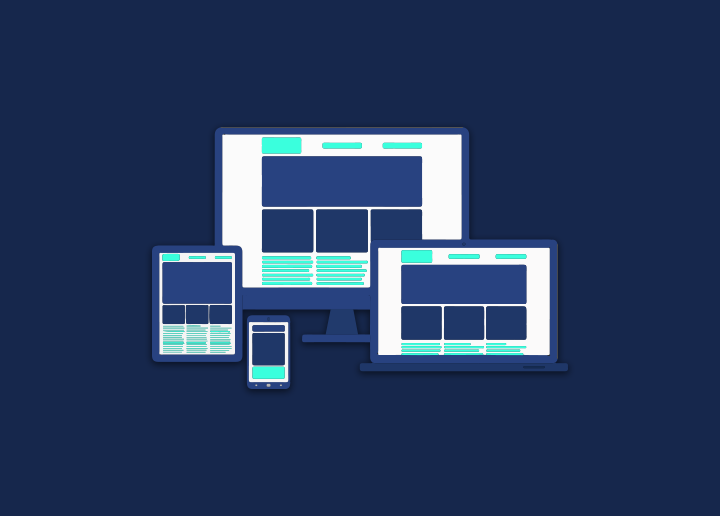
The capacity of a website to change its presentation to accommodate any device it is being viewed on is what we mean when we talk about a website’s responsiveness. The days when most people utilized desktop personal computers are long gone; now, laptops, netbooks, tablets, tiny tablets, e-book readers, and smartphones, as well as phones, are used.
These many electronic gadgets each have their unique screen dimensions and resolutions. A website that is “stiff” will not be able to adjust to (or, let’s say, react to) the screen sizes used. A horizontal scrollbar in the browser is one of the most prominent indicators that the website in question is not responsive.
On the other hand, a website that uses a responsive theme will be able to adjust to different screen sizes and ensure that the information can be read easily, regardless of the screen size.
Does the responsive theme look exactly the same on all devices?
No. A responsive theme will modify the display so visitors can utilize the website content. It is the primary goal of a responsive theme. For the website to accomplish this objective, some of its accessory components may be hidden, and the sizes of other members may be altered.
How can I tell if the theme I’m using is responsive?
You should have no trouble determining how responsive the theme is. Open it on display screens of all sizes, including computer monitors and mobile phones. The responsiveness of your website may be determined by whether or not it displays correctly and whether the information can be read. If you do not have access to various devices, another option is to perform an online test.
Is it crucial to ensure your website and theme are responsive?
The typical response is that the answer is “Yes,” and that it is highly essential. But before you decide to undertake a makeover of your website to change it into a responsive one, you should look at the statistics about the traffic your website receives on the internet. Make an effort to determine how much of your website’s traffic comes from mobile devices using the information provided below. Websites are typically meant to be accessed on desktop computers or laptops; however, if a considerable amount of traffic comes from portable electronic devices such as tablets or mobile phones, you should examine how your website appears on such devices.
Mobile devices account for an average of 27 percent of the traffic received by websites based in Asia. This proportion would be substantially more significant for websites hosted in regions such as Europe and the Americas because mobile devices are generally much more prevalent in those regions.
Which technologies contribute to the responsiveness of a website?
It may surprise you, but responsiveness may be readily accomplished by simply utilizing CSS. You can stylize your website appropriately for a variety of screen kinds, thanks to the current CSS standards. It indicates that you are free to use various sets of CSS rules for each available screen size.
Refer to Seahawk Media for more such articles.


