First impressions matter, and nothing makes a better impression than your logo. But it’s not just the shape or design; logo color schemes play a considerable role. The right colors can spark emotion, create memory, and instantly drive action.
Think of Coca-Cola’s red or Cadbury’s purple. These brands didn’t guess their colors; they chose shades that reflect their identity and connect with their audience. A logo’s color gives your brand a voice people remember.
In this guide, we cover the top color schemes and how they shape brand perception. You’ll learn to choose colors that make your brand unforgettable.
TL;DR: How Color Choices Shape Strong Brand Identity?
- Colors influence how people emotionally connect with a brand. Shades like red for energy or blue for trust help communicate meaning instantly.
- Modern branding favors clear palettes such as monochrome, bright contrasts, natural tones, and soft pastels that improve recognition and visual appeal.
- Effective color selection should align with audience preferences, brand values, and competitive positioning.
- Combining color with typography, shapes, gradients, and responsive design strengthens visual identity and ensures consistency across digital and print platforms.
The Psychology of Logo Colors: What Do They Say About Your Brand?
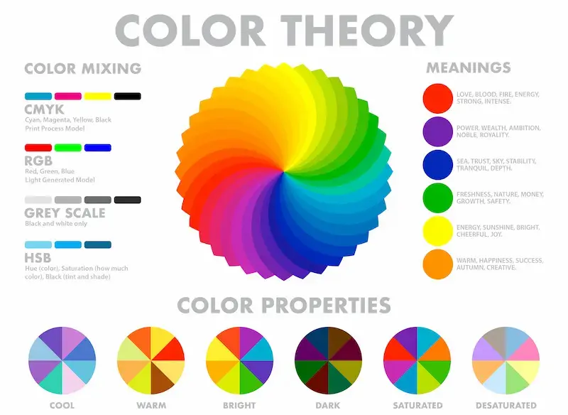
Understanding the psychology behind colors is the first step toward nailing your logo’s color scheme. Here’s a quick look at what some popular colors typically communicate:

- Red: Bold, energetic, and passionate (think Coca-Cola, Netflix)
- Blue: Trustworthy, calming, and dependable (Facebook, Samsung)
- Yellow: Optimistic, happy, and youthful (McDonald’s, Snapchat)
- Green: Natural, eco-friendly, and peaceful (Starbucks, Whole Foods)
- Black: Sleek, powerful, and luxurious (Nike, Chanel)
- Purple: Creative, regal, and mysterious (Twitch, Cadbury)
These associations help customers connect with your brand even before they’ve tried your product or service.
Make Your Mark with a Stunning Logo
Let our expert team craft a custom logo that captures the perfect color scheme and truly stand out.
Top Trending Logo Color Schemes
Choosing trendy logo color schemes can make your brand feel fresh and current. Here are some of the hottest logo color combinations we’re seeing:
Monochrome Madness: Clean, Minimal, and Timeless
Monochrome schemes, using different shades of one color, are having a moment. They’re elegant, straightforward, and work wonders for minimalist brands. Nike, for instance, has mastered the black-and-white logo, creating timeless, universal appeal.
Why it works: Monochrome logos are versatile and easily adaptable across media, such as websites, product packaging, and billboards.
Find: Top Picks for Best Inexpensive Logo Design Services
- Bold and Bright Combos: Attention-Grabbing and Energetic: Who says logos has to be subtle? Bright, contrasting color combos like red and yellow (McDonald’s) instantly grab attention and create a sense of excitement. These work particularly well for brands looking to make a loud statement.
Why it works: Bright colors are hard to ignore and evoke a sense of urgency or enthusiasm. If you want your logo to stand out in a sea of competition, this might be the way to go.
- Earthy and Natural Tones: Eco-Friendly and Grounded: Earthy tones, greens, browns, and soft blues are increasingly popular with sustainability on everyone’s mind. Starbucks’ green logo is a prime example, symbolizing its connection to nature and sustainability.
Why it works: Natural tones create trust and relatability, making customers feel your brand is authentic and conscious about the planet.
Read: New Web Design Trends
- Pastel Palettes: Soft, Approachable, and Calming: Pastels are gentle on the eyes and exude a welcoming vibe. Think Instagram’s playful gradient or Glossier’s soft pink tones. They’re perfect for brands that want to appear friendly, modern, and approachable.
Why it works: Pastel colors feel fresh and trendy, appealing especially to younger, style-conscious audiences.
Interesting: Best Startup Company Logo Designs for Your New Business
How to Choose the Best Logo Color Scheme for Your Brand?
Now that you’re familiar with the top color trends, how do you pick the perfect color scheme for your logo? Here’s a helpful step-by-step guide:

- Understand Your Audience: Before thinking about colors, step back and ask yourself: Who am I trying to reach? Your target audience’s preferences should guide your choice.
For instance, a bold and modern color scheme might resonate more with young, tech-savvy users. On the other hand, a wellness brand may benefit from soft, calming tones.
Check this: WordPress Website Design Templates for Your Business
- Reflect Your Brand’s Values: Your logo is the visual representation of your brand’s mission and values. You might opt for vibrant, cutting-edge colors if your brand stands for innovation. If it’s more about reliability and trust, cool blues and greys can communicate that stability.
Read: Reasons to Hire a Professional Agency For WordPress Design
- Consider the Competition: While following industry standards is essential, you don’t want to blend in with the crowd. Look at what your competitors are doing, then go the extra mile to differentiate yourself.
For example, if most of your competitors use blues, maybe a vibrant orange could set your logo apart.
Explore: A Guide to Logo Design
Beyond Color: Design Elements to Pair for Maximum Impact
While choosing the best logo color schemes is vital, truly standout logos are about more than just the right color combination. Typography, motion, textures, and shapes all contribute to how your brand is perceived.

When paired strategically with a thoughtful color palette, these design elements help elevate your brand identity and make your business logo more memorable.
Motion and Dynamic Logos: Movement That Captures Attention
As brand design evolves, many companies are embracing motion-based or adaptive logos that shift in shape, layout, or color depending on the platform or context.
Think of Google’s ever-changing doodle or Airbnb’s animated symbol. Motion logos offer flexibility and help brands feel modern and interactive.
Why it works: Movement adds a layer of excitement and engagement. It draws attention and boosts brand recall when paired with vibrant or bold color combinations, like a bright red shifting into orange or pink gradients. This approach makes sense for tech-forward industries or brands that want to stand out in the digital space.
Pro Tip: Use high-contrast, complementary colors that remain recognizable even when animated or resized. This ensures your brand logo stays consistent across all touchpoints, from websites to apps.
Also Read: Fix “WordPress Missing Color & Underline Font Options”
Typography and Shapes: Structuring Your Brand’s Voice
Color might be the most eye-catching element, but typography and geometric shapes convey your brand’s message.
For instance, bold typefaces paired with a warm hue can suggest strength and passion. On the other hand, thin sans serifs in light blue or soft grey tones project calm and security, which are popular in the financial and tech industries.
Why it works: Shapes and fonts create visual structure. Rounded shapes paired with pastel palettes give off a friendly, approachable vibe (ideal for wellness brands), while angular logos using cool tones like blue or purple convey focus, professionalism, and dependability. Most logos balance color and form to build a cohesive, strategic image.
Consider this: Circles can symbolize unity or wholeness, whereas triangles suggest innovation and forward momentum. Match these shapes with the right color palette to double down on emotional cues rooted in color psychology.
Learn More: Green Muted Color Combinations: Elegant Pairings for Modern Web Design
Textures and Hand-Drawn Elements: Authenticity That Resonates
Modern brands are leaning into the natural world, using organic textures, imperfect lines, and hand-drawn elements that reflect authenticity and warmth.
When paired with earthy shades like brown, green, and muted blues, these design choices can evoke trust and a sense of groundedness.
Why it works: Consumers crave brands that feel human. Adding texture to your logo, whether a brushstroke effect or grainy shading, makes it feel less mechanical and more personalized. Combine these elements with a warm color palette to evoke a sense of comfort and relatability.
Example: A small artisan coffee shop might use hand-lettered typography and a brown-and-gold logo color scheme to convey craftsmanship and warmth, distinguishing itself from colder, corporate competitors.
Accessibility note: Ensure any textures used don’t interfere with the clarity of your symbol. Accessibility and readability remain key, especially in digital applications.
Discover More: How to Create an Aesthetic Muted Color Palette for Your Website
Gradients and Chroma Accents: Make Your Logo Pop
Gradients aren’t just a trend; they’re a powerful way to add depth and dimension to your business logo. When used correctly, gradients can make even the simplest symbols feel dynamic and visually engaging.
Designers are leaning into high-chroma accents: ultra-saturated blues, greens, and pinks that give a logo punch without overwhelming the senses.
Why it works: Gradients let you blend colors in a fluid, exciting way. For instance, a gradient from purple to electric blue can convey creativity and innovation, which is ideal for design agencies or tech startups. These combinations also allow you to integrate cool and warm tones into one seamless brand image.
Example: Instagram’s iconic pink-to-orange gradient logo stands out in a sea of flat design. Its vibrancy conveys energy, youth, and digital flair, while remaining instantly recognizable.
Tip: Use the color wheel to identify gradient-compatible complementary colors that avoid clashing and maintain visual harmony.
Related: Online Store Conversion: What Colors Make People Want to Buy
Responsive and UX-Friendly Logos: Adapting to Every Screen
Your logo must look good everywhere, from a giant billboard to a 50-pixel favicon. In today’s fast-paced digital world, responsive logo design is no longer optional. That means choosing flexible, scalable, and legible logo color schemes and shapes across all devices.

Why it works: Some colors and shapes lose clarity when scaled down. For example, light blue may look appealing on a desktop but become illegible on a mobile screen without enough contrast. Stick with intense, eye-catching colors and high contrast combinations that maintain visibility across different platforms.
Helpful tip: Many brands create simplified versions of their logos for smaller spaces, ensuring their primary color, symbol, or key shape remains intact. Consider accessibility; your logo should also work in black and white, grayscale, and dark mode.
Bonus: Responsive logos paired with timeless color schemes, such as monochrome or bold red-and-yellow combinations (à la McDonald’s golden arches), help maintain recognition and impact across screen sizes.
Know More: Responsive Design Beyond Mobile: Crafting Experiences for All Devices
Emotion-Driven Color Strategies: Color Psychology in Action
When choosing the best logo color schemes, it’s essential to go beyond aesthetics and examine how color psychology affects your audience’s emotions and decisions.
The right color combination doesn’t just look good; it tells a story, triggers a feeling, and shapes perception.

Why it works: Studies show that most logos in specific industries follow predictable patterns, and blue logos dominate finance and tech for a reason. Blue symbolizes trust, calm, and security. Meanwhile, orange suggests energy and creativity, and yellow evokes optimism and warmth.
Industry Example: A law firm may stick to cool blue or navy hues to convey authority and professionalism, while a kid-focused brand might choose bold, bright combinations like green and yellow to convey playfulness and creativity.
Avoid this mistake: Picking a particular color just because it’s trendy can backfire. It may convey mixed or negative connotations to your audience if it doesn’t align with your brand’s core values.
Strategic Tip:: Match your color palette with your brand’s emotional focus. Want to communicate stability? Cool tones like blue and grey make sense. Looking to project innovation and energy?
Try purple and vibrant pink. Selling eco-friendly products? Earth tones like green and brown are perfect colors to convey your connection to the natural world.
Explore Further: Pink Color Palette in Web Design
Common Logo Color Mistakes to Avoid
When designing your logo, there are some pitfalls you’ll want to steer clear of:
- Clashing Colors: Some color combinations simply don’t work well together and can be jarring to the eye. Make sure your logo colors complement each other rather than clash. Tools like Adobe Color Wheel can help you test out different palettes to find harmonious combinations.
- Using Too Many Colors: Less is often more when it comes to logos. Using too many colors can make your logo look chaotic and unfocused. Stick to two or three complementary colors that convey your brand’s message.
- Ignoring Accessibility: Your logo should be legible and recognizable to all viewers, including those with visual impairments. Test your color scheme for contrast and visibility. You might also consider how your logo appears in grayscale for print materials.
Explore: Logo Design Trends to Boost Your Brand
Best Tools to Help You Choose the Perfect Logo Color Scheme
Choosing the right logo color scheme doesn’t have to be a guessing game. Here are a couple of tools that can make the process easier:
- Adobe Color Wheel: This tool is excellent for playing around with different color combinations. You can create your palette or explore pre-built schemes.

- Canva’s Color Palette Generator: Upload an image, and this tool will instantly generate a color palette based on it. This can help you find inspiration from existing visuals that resonate with your brand.

Related: How to Convert Canva to WordPress?
Final Thoughts: Make Your Logo Stand Out
Your logo’s color scheme isn’t just about looking good; it’s about making a lasting impression. The right colors can elevate your brand, tell a story, and build trust with your audience.
Whether opting for a bold and bright combo or keeping it simple with monochrome, ensure the colors align with your brand’s values and resonate with your target audience.
And remember: Consistency is key. Once you’ve chosen your colors, stick to them across all your brand materials, from your website and social media to packaging and advertising. This will help solidify your brand identity in your customers’ minds.
FAQs About Logo Color Schemes
What are the best logo color combinations for modern brands?
The best logo color combinations often include balanced pairs like royal blue and charcoal grey, vibrant red and mustard yellow, or teal and turquoise.
Many brands also use two colors with contrasting shades to improve visibility. A cool color combination, such as navy blue with jungle green, works well for professional industries and digital platforms.
How do brand colors influence customer perception?
Brand colors communicate emotions instantly. Bright yellow and hot pink suggest energy and creativity, while navy blue and deep purple convey trust and sophistication.
Choosing the right accent color and various shades helps create a memorable and consistent identity across digital marketing channels.
Should a logo use bright or muted tones?
Both can work depending on the brand personality. A bright hue, like vibrant red or turquoise, helps a colorful logo stand out. A muted tone such as beige, charcoal grey, or soft green feels modern and minimal. The key is choosing colors that are well-suited to your audience and industry.
How many colors should you use in your own logo?
Most designers recommend using two colors, or at most three. A simple palette with contrasting shades keeps your logo clean and recognizable. This also helps maintain clarity when placing your company name on websites, packaging, or social media.
What tools help choose a great color scheme for a logo?
Design tools such as color palette generators help explore ideas, preview hex codes, and test various shades. These tools make it easier to build a great color scheme that works across digital marketing assets, branding materials, and even industries like fashion or home decor.


