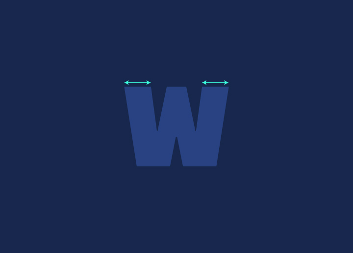
When it comes to typefaces, weight refers to the thickness of the stroke‘s width. Common examples of importance include demibold, light, and bold.
In general, heavier typefaces are more suitable for headlines, while lighter typefaces work better for body text. That said, there are no hard and fast rules – it ultimately comes down to personal preference and the overall look you’re going for with your design.
Experiment with different weights to see what looks best for your particular project. And don’t be afraid to mix things up – pairing a light typeface with a heavy one can create an exciting contrast that can make your design pop.
Different Types Of Weights And Their Uses
There are a variety of weights that can be used in typefaces, each with its purpose. The most common weights are demibold, light, and bold. Demibold is often used for headings and titles, as it is slightly thicker than regular text but not as heavy as bold. Light is often used for body text, as it is easy to read and doesn’t appear too heavy on the page. Bold is typically used for emphasis, such as calls to action or highlights within the body text.
Pros And Cons Of Different Weights
When it comes to the weight of a typeface, there are three main options: light, demibold, and bold. Each has pros and cons that should be considered before making a decision.
Light typefaces are often more legible than their heavier counterparts, making them a good choice for body text. They can also create visual hierarchy by pairing them with heavier typefaces for headlines and subheads. However, light typefaces can sometimes appear delicate or frail and may not make the best impression in more formal situations.
Demibold typefaces balance light and bold, offering the best of both worlds. They’re highly readable and have a good impact, making them a versatile choice for any number of applications. However, they can sometimes be seen as middle-of-the-road and may not stand out as much as you’d like in certain situations.
Bold typefaces are naturally attention-grabbing and ideal for headlines and other high-impact text. They can also be used to add drama or sophistication to a design. However, bold typefaces can be challenging to read at small sizes and may appear overbearing if used too liberally.
When choosing a weight for your typeface, it’s essential to consider the specific needs of your project.
Tips For Choosing The Right Weight For Your Design?
When it comes to choosing the right weight for your design, there are a few things you need to keep in mind. Consider all the below factors when deciding, and you’ll be sure to choose the right weight for your design!
- First, you need to consider the overall tone of your design. Are you going for a more serious look or a more playful one? This will help you narrow down your choices.
- Next, you need to think about the message you want to convey with your design. What do you want people to take away from it? Keep this in mind when making your final decision.
- Finally, don’t forget to consider the practicality of your choice. Will the weight you choose be easy to read? Will it be appropriate for your medium (e.g., print or web)?
Conclusion
Weight is an essential element of typeface design, as it can make a difference in your web page’s overall look and feel. Using different weights and combinations, you can create unique designs to set your project apart. Be sure to experiment with weight when designing your next web page to find the perfect combination for your needs. You can achieve stunning results with the right balance of lightness and boldness!