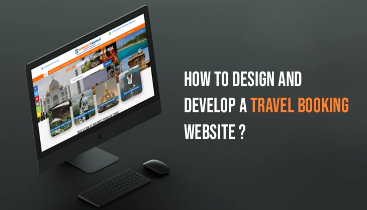
In the world of travel, your journey often begins before you even pack your bags – it starts online. A well-designed travel booking website can be the deciding factor between a user bouncing off or booking a full itinerary. Whether it’s a solo trip, luxury escape, or budget-friendly adventure, travelers today expect fast, intuitive, and visually engaging experiences from booking platforms.
The best travel booking websites do more than just show prices and destinations. They inspire, they guide, & they convert. In this blog, we explore 10 standout examples of travel booking website design that strike the perfect balance between form and function. From sleek minimalism to story-driven layouts, each one offers design cues worth noting.
Best Travel Booking Website Design Examples to Inspire Your Next Project

Looking for design inspiration that blends style with seamless functionality? Here are 10 of the best travel booking website designs that get it right, from intuitive layouts to stunning visuals and conversion-focused UX.
Build a Travel Website That Inspires Bookings
At Seahawk, we specialize in designing powerful WordPress websites for the travel industry — from custom booking experiences to performance-optimized pages that scale with your business.
TripTrap – Travel Booking Simplified
TripTrap stands out with its calm color palette and ultra-clean interface. The homepage invites users with full-screen destination visuals, while the booking form is prominently placed to avoid confusion. The minimalist layout ensures quick decisions without distractions. Icons are well-used to indicate steps, from choosing a location to payment. TripTrap’s smart use of white space and mobile responsiveness make it a favorite for on-the-go travelers. Its focus on clarity and speed shows how less can truly be more in web design.
Pathfinder – Storytelling Meets Itinerary
Pathfinder offers more than a booking service. It shares destination stories through interactive cards that blend real travel reviews with curated itineraries. Each section flows like a travel diary, with day-by-day highlights that users can save, customize, or book instantly. The sticky navigation bar makes it easy to jump between sections. The visual rhythm, combined with typographic hierarchy, gives this website a content-driven edge that’s both engaging and functional. Ideal for users who prefer inspiration first, booking second.
Voyage – Designed for Visual Thinkers
Voyage uses bold, fullscreen photography with minimal text to appeal to visually-oriented users. Each destination page opens with a cinematic shot, followed by essential booking details below. Scrolling triggers animations and micro-interactions, creating a dynamic flow. The booking widget remains fixed on the screen, making conversions frictionless. It’s a perfect example of how visual impact and performance can go hand in hand. For travelers who browse with their eyes first, Voyage is a visual delight.
StayScape – Sophistication in Simplicity
StayScape adopts a luxury-inspired design with elegant fonts, muted tones, and high-resolution hotel imagery. The homepage greets users with curated travel collections like “Romantic Retreats” or “Island Escapes,” helping them filter experiences right away. The design emphasizes trust by placing testimonials, ratings, and partner logos front and center. Smooth transitions and soft hover effects enhance usability without overwhelming. It’s built for users seeking more refined and memorable travel moments.
Jetlinker – Seamless Multi-Option Bookings
Jetlinker offers a polished, functional interface tailored to users booking flights and hotels together. Tabs across the top let users toggle between travel modes. The booking form has live price updates and an interactive calendar for flexible dates. Progress bars show how far the user is in the booking process. The consistent layout across pages builds trust, and the responsive design ensures performance on all devices. Jetlinker is a solid choice for functionality-focused travelers who value clarity and control.
Wanderlust Inn – Immersive Visual Escapes
Wanderlust Inn takes immersion to the next level. From the moment users land on the site, they’re greeted with ambient sounds and soft transitions between background videos of the property. The booking interface feels like part of the scenery rather than a separate function. Details such as room features and amenities are tucked into collapsible panels, keeping the design clean yet informative. This design works well for boutique properties that want to sell an experience, not just a room.
Skywinks – Straightforward Budget Travel
Skywinks appeals to price-conscious travelers with a no-frills, data-driven design. The site features a search-first layout with smart filtering for dates, prices, and airlines. Each result includes icons for baggage, Wi-Fi, and layovers, helping users make informed decisions quickly. A price trend graph for selected dates adds a helpful visual layer. Clean buttons and quick-loading pages show that speed and utility were top priorities here. It’s perfect for frequent flyers or backpackers who want efficiency over flair.
Bebiria – Your Personal Travel Assistant
Bebiria acts like a personalized travel assistant. From the start, users are asked about their travel preferences, which tailors the homepage to relevant deals and content. The layout features friendly language, card-based destination suggestions, and floating buttons for quick access to customer support. Icons and microcopy add a conversational tone. While minimal, the design feels personal and interactive. Bebiria is best for first-time travelers or those who prefer a guided, supportive experience.
Mirror House – Designed for Unique Properties
Mirror House focuses exclusively on unique architecture and eco-lodges. The layout mirrors that personality with asymmetrical grids, transparent overlays, and smooth scrolling galleries. Instead of standard booking buttons, each property has a “Learn and Stay” CTA that takes users through its story before booking. The typography is distinctive yet readable, aligning with the niche’s creative vibe. Mirror Stay proves that a strong brand voice and design cohesion can turn a booking site into a storytelling platform.
Explore SNAELAND – Nature-Focused Navigation
Explore SNAELAND pairs breathtaking visuals of Icelandic landscapes with location-based navigation. Users can explore by region, season, or type of activity. Animated maps help pinpoint popular routes and landmarks. Every trip includes embedded weather forecasts, clothing tips, and travel insurance links. The site is accessible, mobile-friendly, and ideal for nature lovers who plan trips based on natural phenomena. This format helps users connect their bucket list with practical trip options.
Tips for Designing an Effective Travel Booking Website

Designing a travel booking website involves more than using beautiful visuals. It requires building user trust, reducing booking friction, and helping travelers feel confident from the moment they land on your site. Here are some practical tips that can make your website more effective and user friendly.
Keep It Simple
A straightforward layout always works better than a cluttered one. Keep your design clean and your calls to action clear. Make sure the most important features like search bars, filters, and booking buttons are easy to locate. Ideally, these elements should be visible on the first screen without scrolling. Simplicity improves usability and encourages faster decisions.
Prioritize Speed
A slow travel website can quickly turn potential customers away. Travelers often search for flights or hotels during short breaks or while commuting. If your site takes too long to load, they will leave. Use optimized images, minimize unnecessary code, and choose a reliable hosting service to speed things up. Faster websites also tend to perform better in search rankings.
Highlight Real Photos
Authenticity creates trust. Instead of relying on generic stock photos, use high quality real images of destinations, hotels, and activities. Real visuals help travelers imagine themselves in the experience you are offering. Include photo galleries, immersive imagery, or even short videos that show the real look and feel of your services.
Optimize for Mobile
Many users plan and book their trips using smartphones. Your website must work smoothly on smaller screens. Design with responsive layouts, large touch-friendly buttons, and readable text. Test the booking flow on different mobile devices to ensure there are no issues. A mobile friendly design increases the chances of conversions on all platforms.
Add Smart Filters
Help users find the right option faster with detailed search filters. These could include price range, amenities, accommodation type, customer ratings, or travel dates. Smart filters remove unnecessary options and make the search process more efficient. Filters can also guide users toward better decisions based on their preferences.
Simplify the Booking Process
An easy booking process is one of the most important features. Break the journey into clear steps or keep everything on a single page. Reduce the number of fields, use friendly language, and make sure everything works properly. Allow users to review their selections before confirming. A smooth booking experience improves satisfaction and increases trust.
Use Trust Signals
People will only book when they feel safe. Trust indicators like customer reviews, secure payment icons, and badges such as Verified Property or Free Cancellation can help reassure users. Display your partnerships or ratings if available. The presence of trust signals makes visitors feel more secure and confident in finalizing their bookings.
Conclusion
Designing a successful travel booking website is part art, part science. It requires an understanding of both user psychology and technical usability. The examples above show how creativity, functionality, and a customer-first mindset come together to create compelling digital experiences.
Whether you’re launching a new travel platform or revamping an existing one, these designs offer valuable insights to guide your vision. Keep your focus on usability, inspiration, and trust, and you’ll build a platform travelers will keep coming back to.
Looking to design your own travel booking site? Let these examples be your starting compass, and don’t forget to pack your creativity.


