


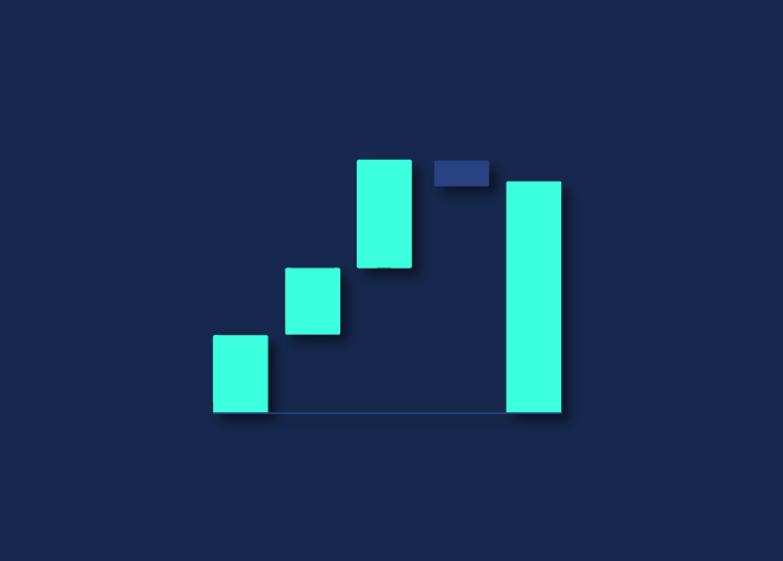
This article will briefly explain the waterfall chart and how to use it to improve your website loading time. A waterfall chart is a graphical representation of how a website loads, depicting the sequential order of page elements loading from top to bottom. The chart can be used to identify problems in the loading process and optimize website performance.
Web developers and web admins often use Waterfall charts to troubleshoot slow-loading pages. By identifying which elements take the longest to load, they can make changes to the code or website configuration to speed up the overall page loading time.
Several tools can be used to create waterfall charts, including Google Chrome’s Developer Tools, WebPagetest, and GTmetrix.
How to create a Waterfall Chart?
Waterfall charts are used to visualize how particular metric changes over time. In website speed and performance, waterfall charts can visualize how different page load elements (e.g., HTML, CSS, JavaScript) impact the overall load time.
To create a waterfall chart, you will need to collect data on the various elements of your page. Many tools can help with this, including Google’s PageSpeed Insights and WebPageTest. Once you have collected this data, you can input it into a tool like Excel or Google Sheets to create the actual chart.
There are a few things to keep in mind when creating a waterfall chart:
- Make sure all your data is in one place before starting. This will make it much easier to input into your chosen tool.
- Pay attention to the scale of your chart. Consider using a logarithmic scale if there is an extensive range of values (e.g., if some page elements take much longer to load than others).
- Use colors carefully. Too many colors can make the chart difficult to interpret; Stick to a few key colors that will help highlight important information.
Pros and Cons of a Waterfall Chart
A waterfall chart is an excellent tool for visualizing the load time of a web page or application. It can help identify bottlenecks and optimize performance.
However, there are some drawbacks to using a waterfall chart.
- First, a waterfall chart can be challenging to interpret. The different colors and lines can be confusing and make it hard to see the overall picture.
- Second, a waterfall chart only shows the load time for each element on a page or application. It doesn’t show how long it takes for the page or application to render in the browser.
- Finally, a waterfall chart is only useful for measuring performance on one specific page or application. It could be more helpful for measuring a website’s or system’s overall performance.
How to read a Waterfall diagram?
Waterfall diagrams are a tool that web developers use to visualize the loading of a web page. The diagram shows the order in which resources are loaded and allows developers to identify bottlenecks in the loading process.
When looking at a waterfall diagram, the first thing to look for is the page’s overall loading time. This is shown at the bottom of the diagram. If the overall loading time is extended, there is likely a problem with one or more of the resources being loaded.
The next thing to look for is how long each resource takes to load. This information is shown in the middle of the diagram. If any resource takes an unusually long time to load, then that could be causing your page to load slowly.
Finally, you’ll want to look at how resources are loaded. This information is shown at the top of the diagram. In most cases, you’ll wish for your HTML file to load first, followed by your CSS files and then your JavaScript files. If your resources are not being loaded in this order, then that could also be causing your page to load slowly.
Conclusion
A waterfall chart is a valuable tool for website speed and performance analysis. It allows you to visualize the load time of each element on a page, which can help you identify issues and optimize your site accordingly. While waterfall charts may seem daunting initially, they’re pretty simple to interpret once you know what you’re looking for. With a bit of practice, you’ll be able to use them to improve your website’s speed and performance in no time.